
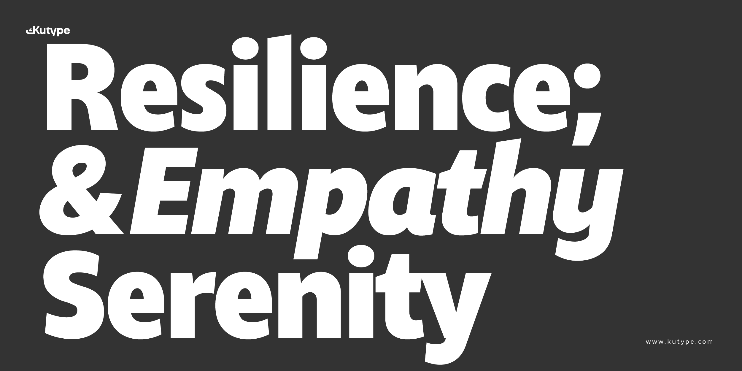
Zahir Sans
Upright Variable
100px
Reading begins with the eyes before it reaches the mind.
Zahir Sans
SemiBold
57px
Each typeface opens a different horizon: the straight conveys order, the curved conveys flow, the contrast evokes visual drama.
Zahir Sans
Regular
17px
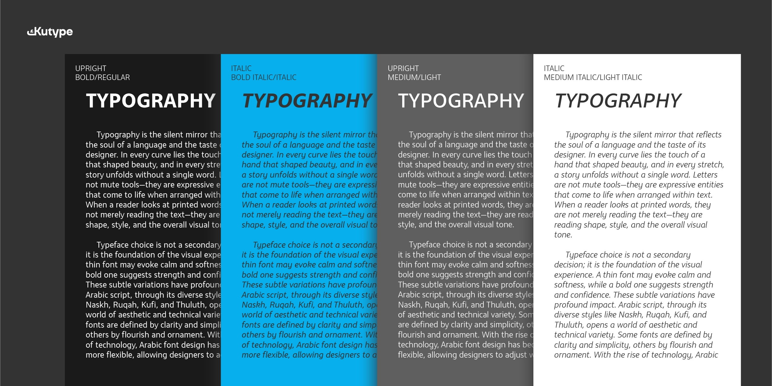
When we shape its form and trace its features, we define the personality of the text and its hidden voice. Typography is an art that balances strictness with freedom, geometric precision with visual spontaneity.
Each typeface opens a different horizon: the straight conveys order, the curved conveys flow, the contrast evokes visual drama. In the end, the reader remains captive to this silent language that speaks first to the eye, then to the tongue, with rhythm before words.
Typography is not a rigid science, but an art that weaves meaning with threads of light and shadow. Letters are not isolated units but living forms that interact with space, creating a visual rhythm that precedes words. The eye reads before the mind, and thus the form of text becomes as significant as its content.
The straight letter reminds us of order, the curved suggests softness, the slanted conveys movement. From these differences harmony is born, turning writing into an aesthetic experience that goes beyond conventional reading. Typography, then, is the meeting point of form and meaning, of silence and speech.
Buying Options
Bundle
Individual
License
Price
Total $0.00