Sahil font - A Neo-classical serifless typeface
Sahil – A Neo-Classical Editorial Typeface for Timeless Publishing and Refined Visual Storytelling
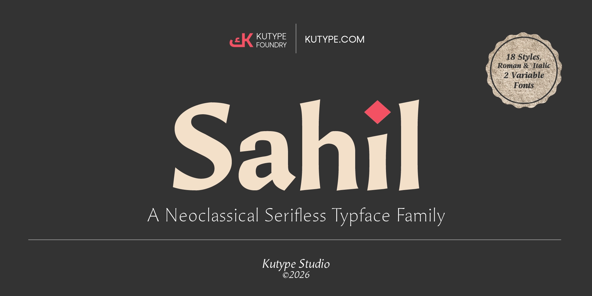
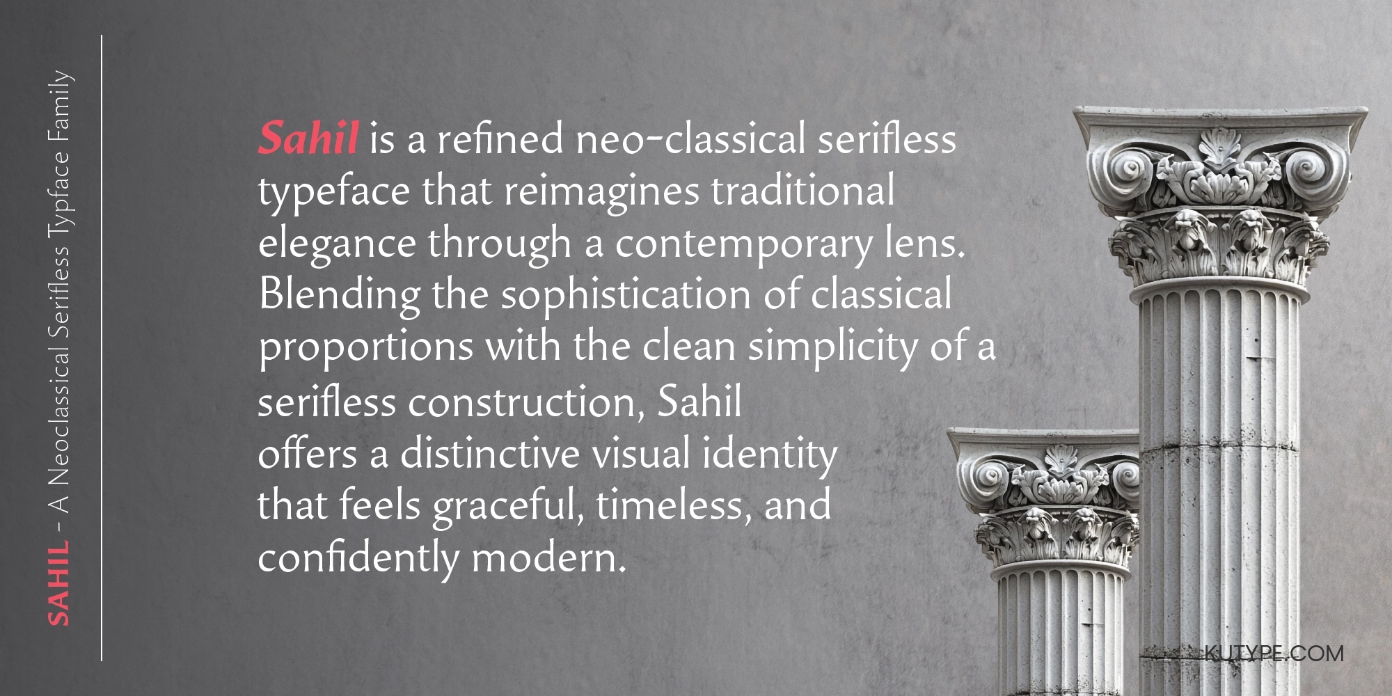
In editorial design, typography serves a greater purpose than simply presenting information—it establishes atmosphere, communicates authority, and shapes the reader's first impression long before the content is understood. Sahil was created from this philosophy, offering a neo-classical editorial typeface that bridges historical refinement with contemporary precision. Rather than pursuing excessive ornamentation or rigid minimalism, Sahil embraces balance. It combines clean serifless construction with delicate flaring serif details and subtle humanist influences, resulting in a typeface that feels sophisticated, cultured, and enduring.
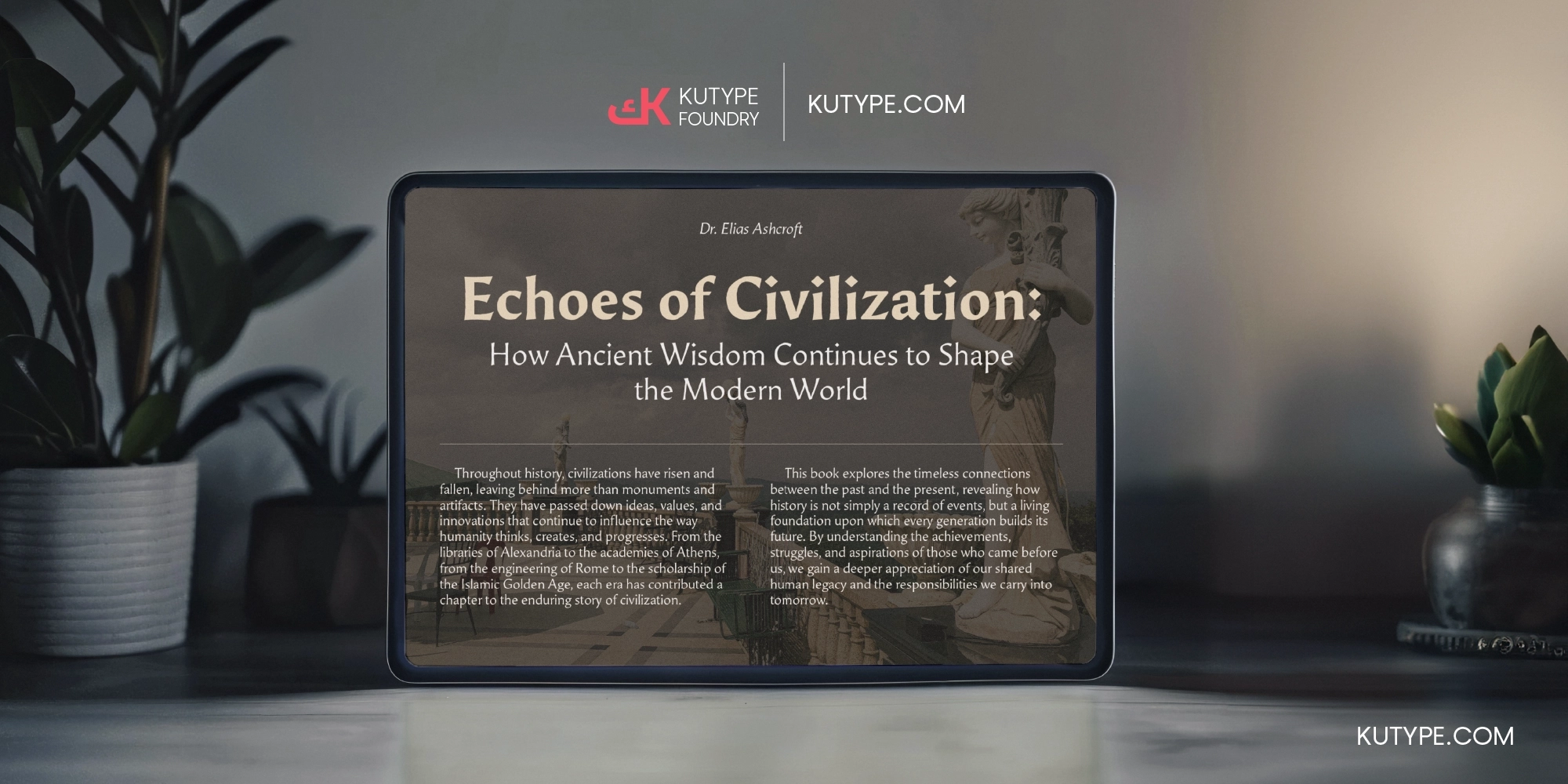
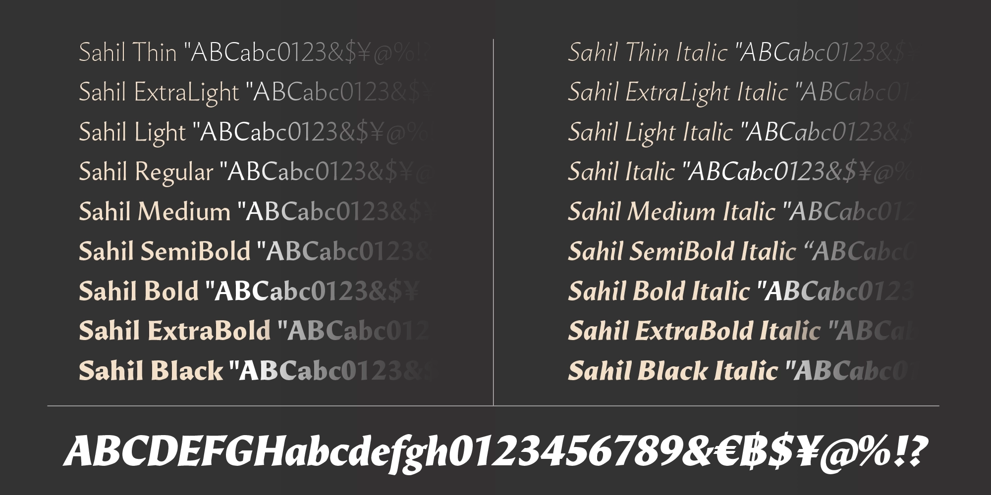
Developed primarily for editorial environments, Sahil was designed to excel where typography becomes part of the narrative itself. Whether appearing across magazine spreads, book titles, museum catalogues, publishing identities, luxury journals, or cultural branding, the typeface delivers a confident visual presence without overwhelming the content. Every character has been carefully refined to achieve harmony between elegance and readability, allowing designers to create layouts that feel both contemporary and timeless. Available in eighteen carefully engineered styles together with two Variable Fonts, Sahil offers remarkable flexibility while maintaining a consistent editorial voice throughout every weight and italic.
Meaning & Philosophy
The name Sahil originates from Arabic, meaning shore, coast, or the place where land meets the sea. Symbolically, it represents a point of connection—a meeting place between different worlds. This idea perfectly reflects the philosophy behind the typeface itself.
Sahil exists at the intersection of classical tradition and modern typography. It respects the proportions, rhythm, and elegance inherited from centuries of typographic history while embracing the clarity demanded by contemporary editorial design. Like a shoreline where two landscapes naturally converge, Sahil unites historical craftsmanship with modern visual communication in one harmonious system.
Philosophically, Sahil is built upon the belief that timeless typography never competes with content—it elevates it. The most successful editorial typefaces possess quiet confidence. They guide the reader's eye, create rhythm across a page, and communicate sophistication without unnecessary distraction.
Every proportion, stroke, and curve was designed to embody restraint rather than excess. Instead of relying on decorative complexity, Sahil celebrates refined details, balanced spacing, and subtle expression. The result is typography that feels intelligent, graceful, and enduring across generations of design.
Design Inspiration
Sahil draws its inspiration from the enduring beauty of classical civilization and medieval manuscript traditions. Ancient Roman inscriptions, Renaissance book typography, illuminated manuscripts, and the disciplined proportions of historical lettering all contribute to the visual language that defines the typeface.
A significant source of inspiration comes from Bioracana, whose elegant balance between historical influence and modern readability helped shape Sahil's design direction. Rather than reproducing historical letterforms, Sahil reinterprets these qualities through a contemporary editorial perspective. The objective was not nostalgia, but continuity—creating a typeface that feels rooted in history while remaining entirely relevant for today's publishing landscape.
Humanist writing traditions also played an important role during development. The subtle movement found in handwritten calligraphy informed the rhythm of the letterforms, introducing warmth and natural flow without sacrificing precision. This human touch softens the geometric structure and allows the typeface to maintain exceptional readability across a wide range of editorial applications.
The restrained use of subtle flaring serif details further reinforces this connection to historical typography. Instead of functioning as traditional serifs, these refined terminals gently broaden the ends of strokes, creating an elegant transition between classical and serifless construction. This delicate treatment gives Sahil its distinctive personality—one that feels familiar, sophisticated, and unmistakably modern.
OpenType Features
Sahil includes a comprehensive collection of professional OpenType features designed to support demanding editorial, publishing, and branding workflows.
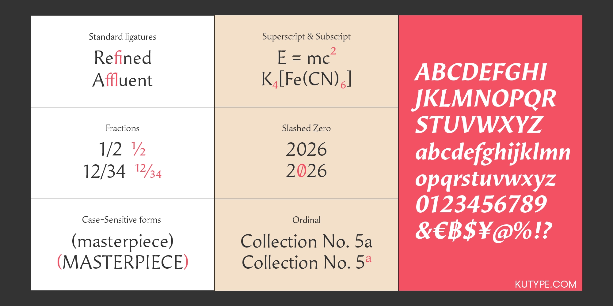
- Fractions (frac) automatically generate professionally formatted fractions for financial documents, cookbooks, technical publications, and editorial layouts.
- Kerning (kern) carefully adjusts spacing between letter pairs, creating consistent visual rhythm and improving overall readability.
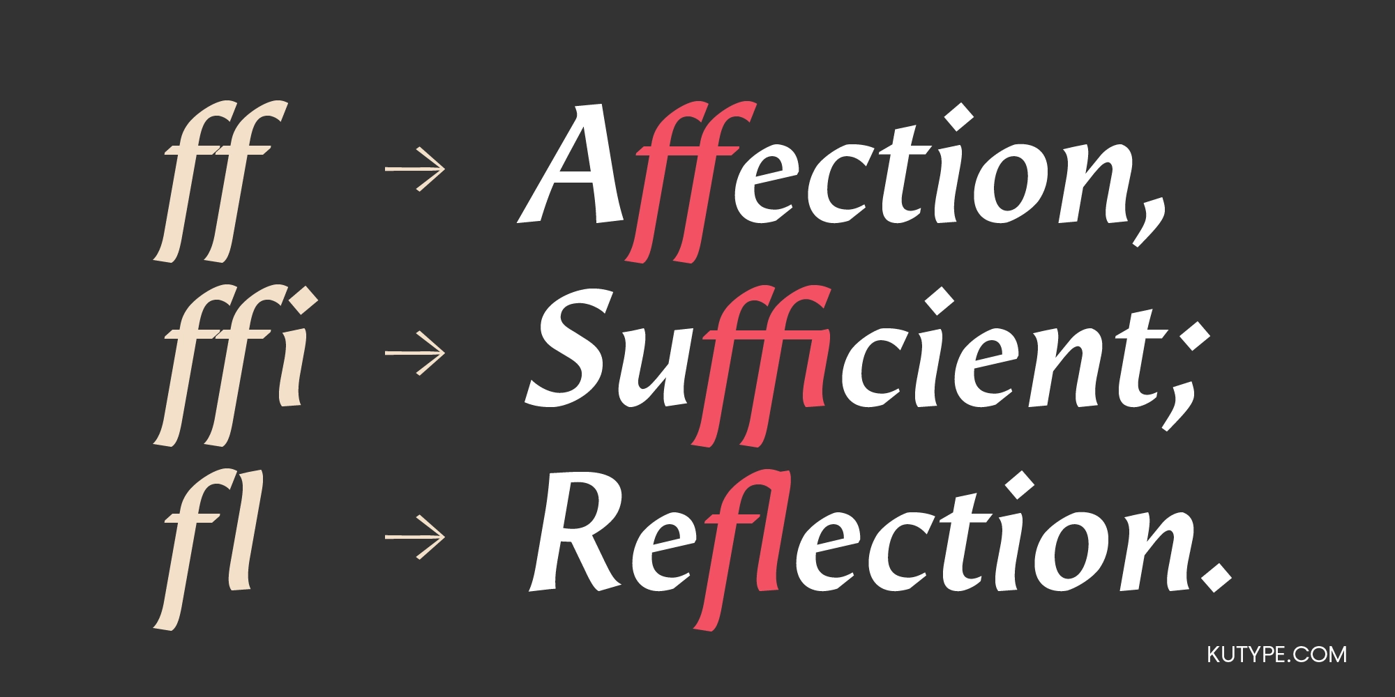
- Standard Ligatures (liga) replace common character combinations with beautifully connected glyphs, producing smoother and more refined typography.
- Discretionary Ligatures (dlig) introduce decorative character combinations that provide additional personality for headlines, logos, and premium editorial titles.
- Localized Forms (locl) automatically substitute region-specific glyphs, ensuring typographic accuracy across multiple languages.
- Ordinals (ordn) correctly format ordinal indicators such as 1st, 2nd, and 3rd for editorial and publishing use.
- Subscript (subs) and Superscript (sups) provide properly scaled scientific, academic, and mathematical typography.
- Case-Sensitive Forms (case) automatically adjust punctuation and symbols when used with uppercase text, creating balanced all-cap compositions.
- Slashed Zero (zero) distinguishes the numeral zero from the capital letter O, improving clarity in technical, coding, and data-driven environments.
- Scientific Inferiors (sinf) support scientific notation and specialized academic publishing.
- Numerators (numr) and Denominators (dnom) enable professional fraction construction and advanced mathematical composition.
Together, these features allow Sahil to perform effortlessly across editorial publishing, books, magazines, cultural institutions, branding, luxury packaging, and sophisticated digital typography.
Positioning & Strength
Sahil is positioned as a neo-classical editorial typeface, created specifically for projects where typography must communicate refinement, authority, and cultural sophistication.
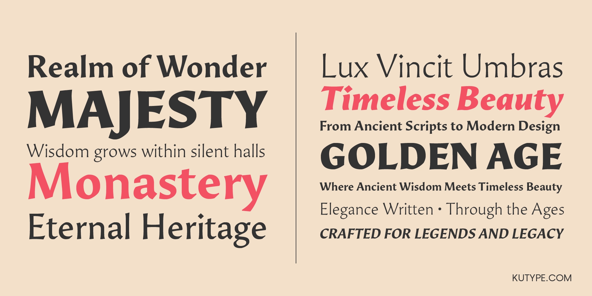
Unlike display fonts designed purely for visual impact or text faces optimized for extended reading, Sahil occupies a unique position between these two worlds. It excels in magazine headlines, book covers, publishing identities, museum catalogues, architectural presentations, cultural institutions, luxury branding, and editorial systems where typography becomes an essential part of storytelling.
Its greatest strength lies in its ability to create atmosphere. The subtle classical influence immediately conveys heritage, intelligence, and trust, while the modern serifless construction ensures clarity across both print and digital media. Designers can confidently use Sahil to establish premium visual identities without appearing overly decorative or historically rigid.
The extensive family of eighteen styles together with two Variable Fonts allows complete typographic systems to be built using a single cohesive family—from elegant headlines to refined captions and supporting editorial elements.
Font Anatomy Overview
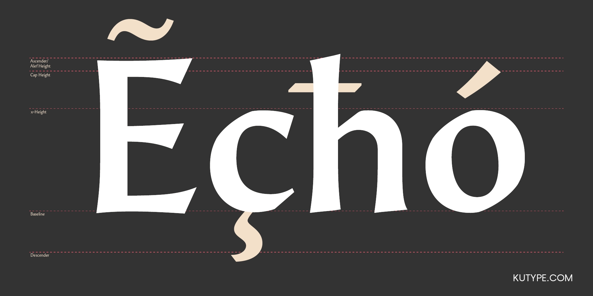
Every detail within Sahil has been intentionally designed to reinforce its neo-classical personality.
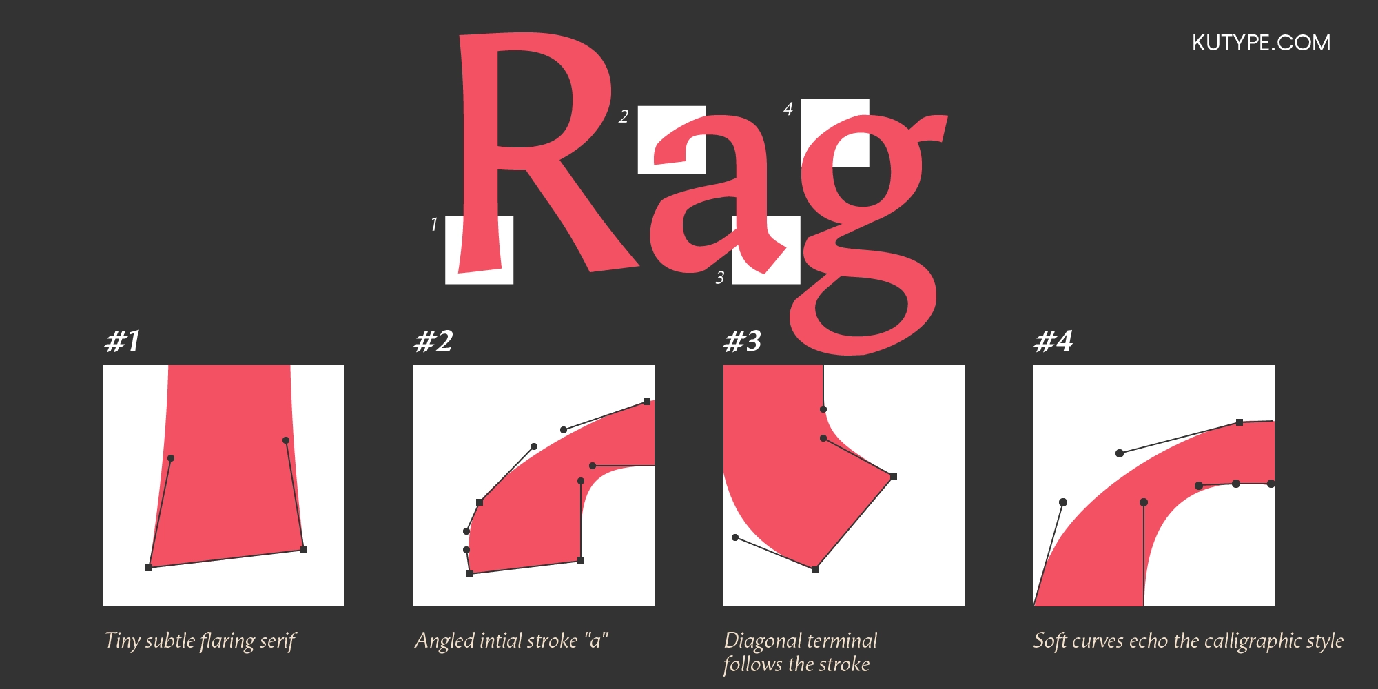
The typeface features tiny subtle flaring serifs, introducing delicate expansions at stroke endings rather than conventional serif structures. These understated details create elegance without compromising the clean silhouette of the letterforms.
Its distinctive angled initial stroke on the lowercase "a" contributes a subtle sense of movement inspired by historical penmanship, providing a graceful beginning to the character while strengthening its humanist identity.
Diagonal terminals naturally follow the direction of each stroke, creating smooth visual transitions that enhance rhythm and improve overall harmony across words and paragraphs. Rather than ending abruptly, strokes conclude with carefully considered movement that feels organic and refined.
Throughout the family, soft curves echo the influence of traditional calligraphy. Gentle modulation, balanced proportions, and flowing contours introduce warmth into an otherwise disciplined structure. This subtle calligraphic character gives Sahil its uniquely human voice while preserving the precision required for professional editorial typography.
Together with carefully balanced proportions, generous counters, refined spacing, and meticulously engineered kerning, these anatomical details produce typography that feels both timeless and contemporary.
Conclusion
Sahil is more than a neo-classical typeface—it is a carefully considered editorial system built for designers who value timeless elegance, historical inspiration, and contemporary functionality. Inspired by classical civilizations, medieval manuscripts, and the refined character of Bioracana, it transforms historical influences into a modern typographic language suited for today's creative industries.
Its subtle flaring serifs, humanist curves, thoughtful anatomical details, extensive OpenType features, eighteen-style family, and two Variable Fonts provide exceptional flexibility while preserving a unified visual identity.
Whether designing magazines, books, publishing houses, museums, cultural institutions, luxury branding, architecture portfolios, or premium editorial experiences, Sahil delivers typography that communicates intelligence, sophistication, and enduring beauty. Rather than competing for attention, it enriches every page with quiet confidence, allowing stories, ideas, and visual narratives to be presented with clarity, elegance, and timeless editorial excellence.
Looking for a refined serif alternative? Explore Zahir Serif for another classical editorial direction.
Font Name
Sahil
Designer
Nur Syamsi, Bustanul Arifin
Version
Build 1.0 - 2026
Type Category
Latin, Classical font, Serifless
Glyph Count
580
Year Published
July 2026
Supported Languages
Afrikaans, Albanian, Asu, Basque, Bemba, Bena, Bosnian, Catalan, Cebuano, Chiga, Colognian, Cornish, Corsican, Croatian, Czech, Danish, Dutch, Embu, English, Estonian, Faroese, Filipino, Finnish, French, Friulian, Galician, Ganda, German, Gusii, Hungarian, Icelandic, Ido, Inari Sami, Indonesian, Interlingua, Irish, Italian, Javanese, Jju, Jola-Fonyi, Kabuverdianu, Kalaallisut, Kalenjin, Kamba, Kikuyu, Kinyarwanda, Kurdish, Latvian, Lithuanian, Lojban, Low German, Lower Sorbian, Luo, Luxembourgish, Luyia, Machame, Makhuwa-Meetto, Makonde, Malagasy, Malay, Maltese, Manx, Māori, Meru, Morisyen, Navajo, North Ndebele, Northern Sami, Northern Sotho, Norwegian Bokmål, Norwegian Nynorsk, Nyanja, Nyankole, Occitan, Oromo, Polish, Portuguese, Romanian, Romansh, Rombo, Rundi, Rwa, Samburu, Sango, Sangu, Sardinian, Scottish Gaelic, Sena, Shambala, Shona, Slovak, Slovenian, Soga, Somali, South Ndebele, Southern Sotho, Spanish, Sundanese, Swahili, Swati, Swedish, Swiss German, Taita, Taroko, Teso, Tsonga, Tswana, Turkish, Turkmen, Upper Sorbian, Vunjo, Walloon, Walser, Welsh, Western Frisian, Wolof, Xhosa, Zulu
Sahil
68px
Sahil
60px
Sahil
20px
Buying Options
Total $0.00