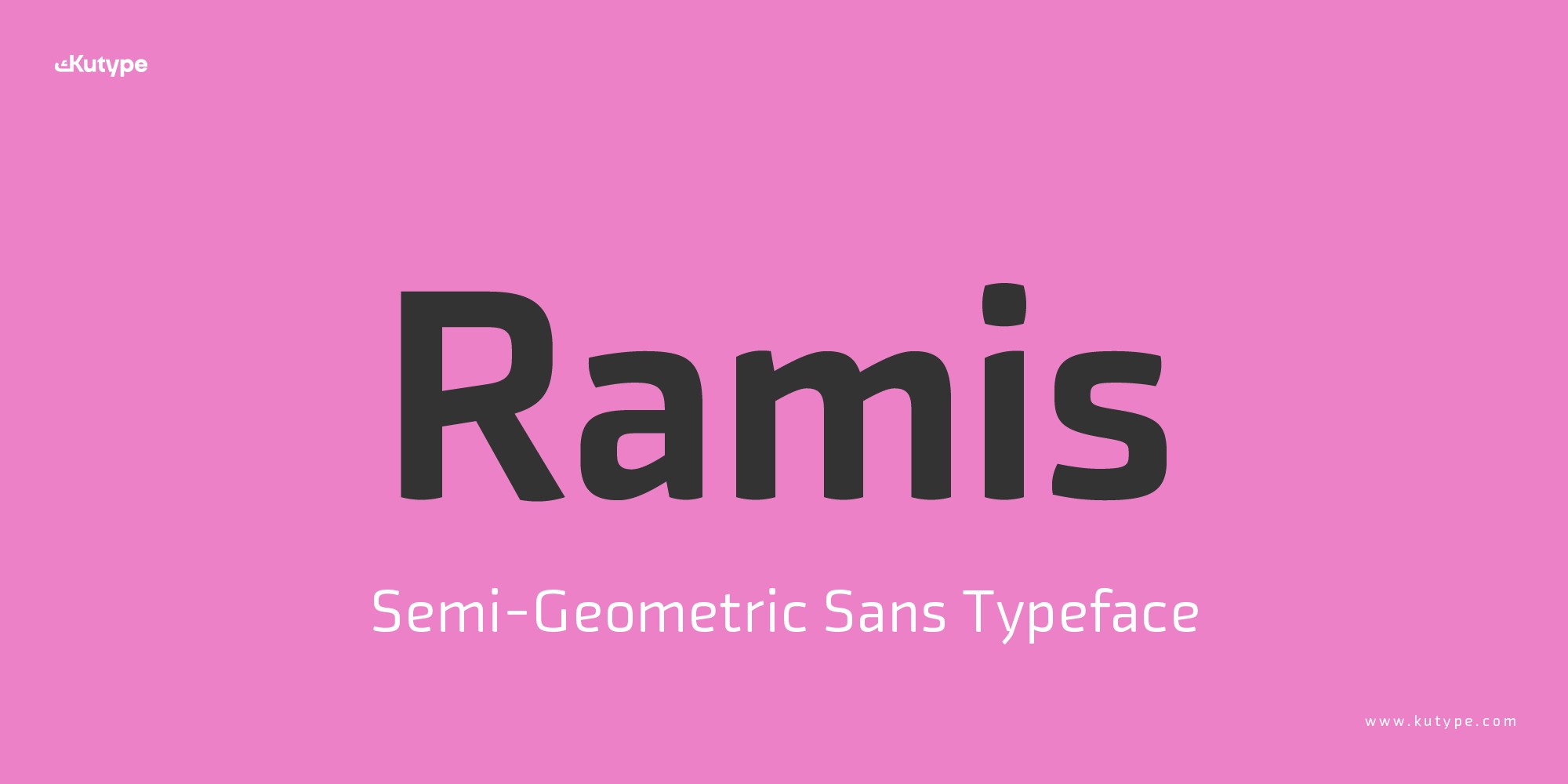
Ramis Font - A Semi-Geometric Sans Typeface for Tech Branding & Digital Apps
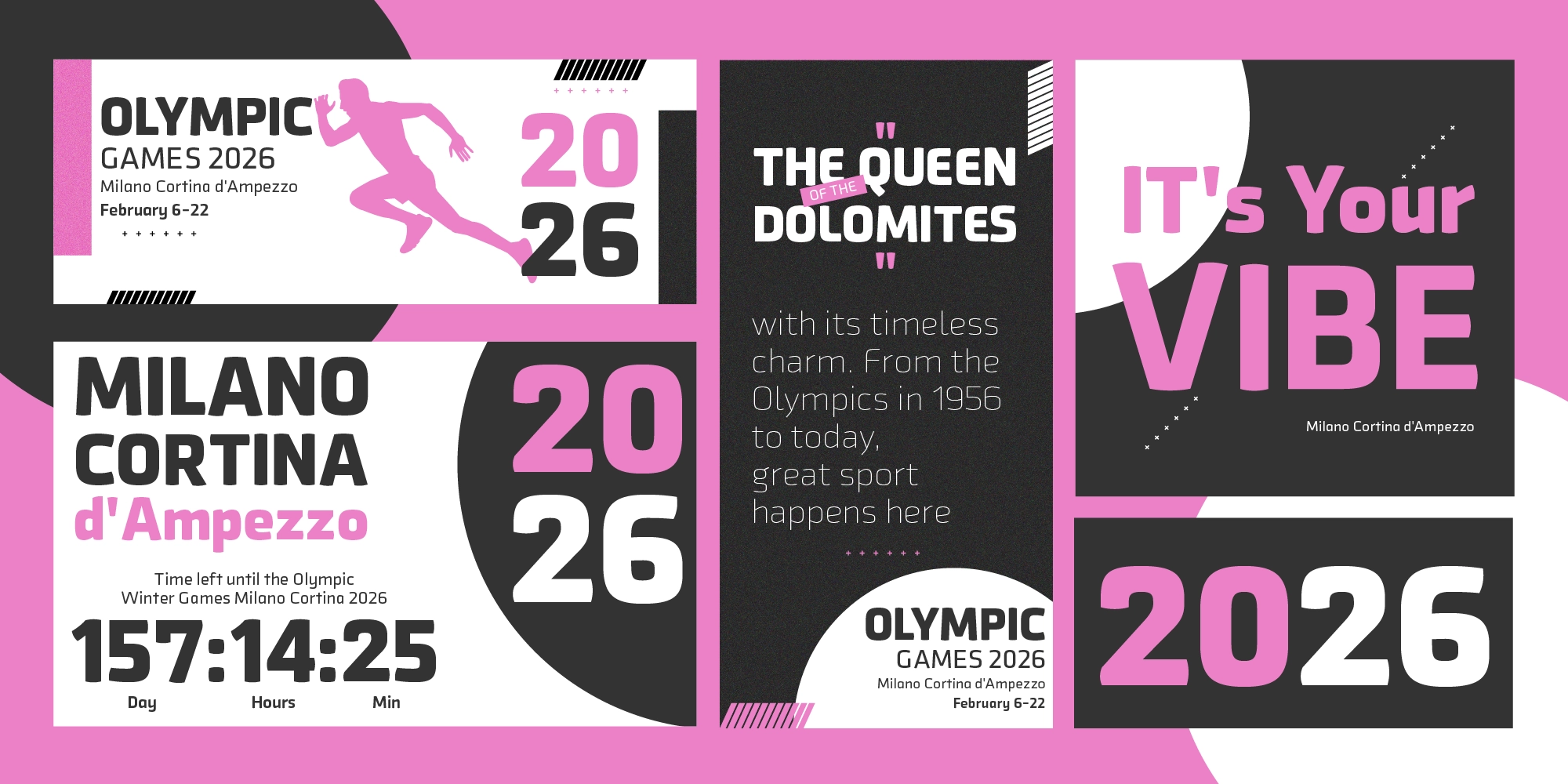
In digital design, choosing the right typeface often comes down to one critical balance: clarity and character. Too neutral, and the design feels generic. Too expressive, and readability suffers, especially across screens. Ramis Semi-Geometric Sans Typeface is built to solve that challenge. A semi-geometric sans-serif designed for tech, branding, and apps, it brings together modern aesthetics with functional precision.
Ramis is crafted to perform across digital environments, from UI interfaces to dashboards, while maintaining a clean, professional tone. More importantly, it is designed with bilingual harmony in mind, ensuring consistency between Latin and Arabic scripts. The result is a typeface that feels modern, scalable, and reliable for long-term use.
Name Philosophy
The name Ramis (رامس) carries a poetic meaning: “one who touches gently.” This idea becomes a guiding principle in the design itself. Rather than appearing overly rigid or mechanical, Ramis introduces a softer, more approachable tone within a structured system.
As a key reference, the design draws inspiration from Klavika, a typeface known for its bold and assertive personality. However, while Klavika leans toward strong visual impact, Ramis takes a different direction, focusing on readability, flexibility, and long-term usability, especially in digital and bilingual contexts.
This approach positions Ramis as a more balanced alternative: modern and confident, yet subtle enough to support continuous reading and complex interfaces.
For designers seeking comparable Geometric Sans fonts, Kashif is another excellent choice worth exploring.
Key Design Characteristics
Ramis sits within the semi-geometric sans-serif category, combining the clarity of geometric construction with the warmth of humanist touches. This hybrid approach allows it to maintain structure without feeling cold or mechanical.
The letterforms are built with:
- Controlled proportions for visual stability
- Moderate stroke contrast for screen clarity
- Soft curves that balance sharper geometric elements
This creates a rhythm that feels consistent and easy to read, particularly in digital environments.
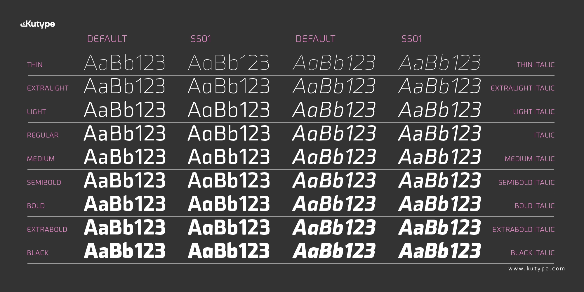
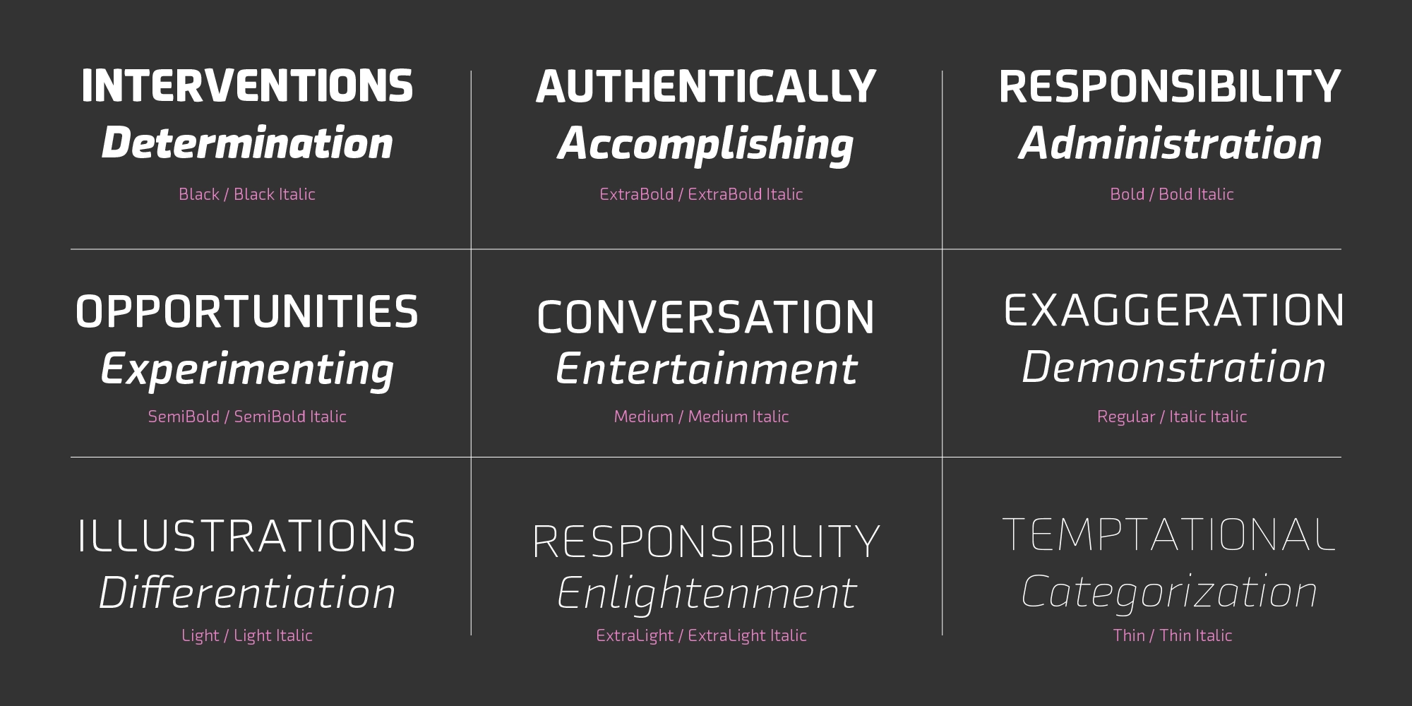
Weight Range & Styles
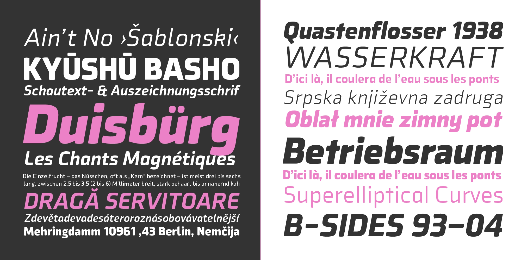
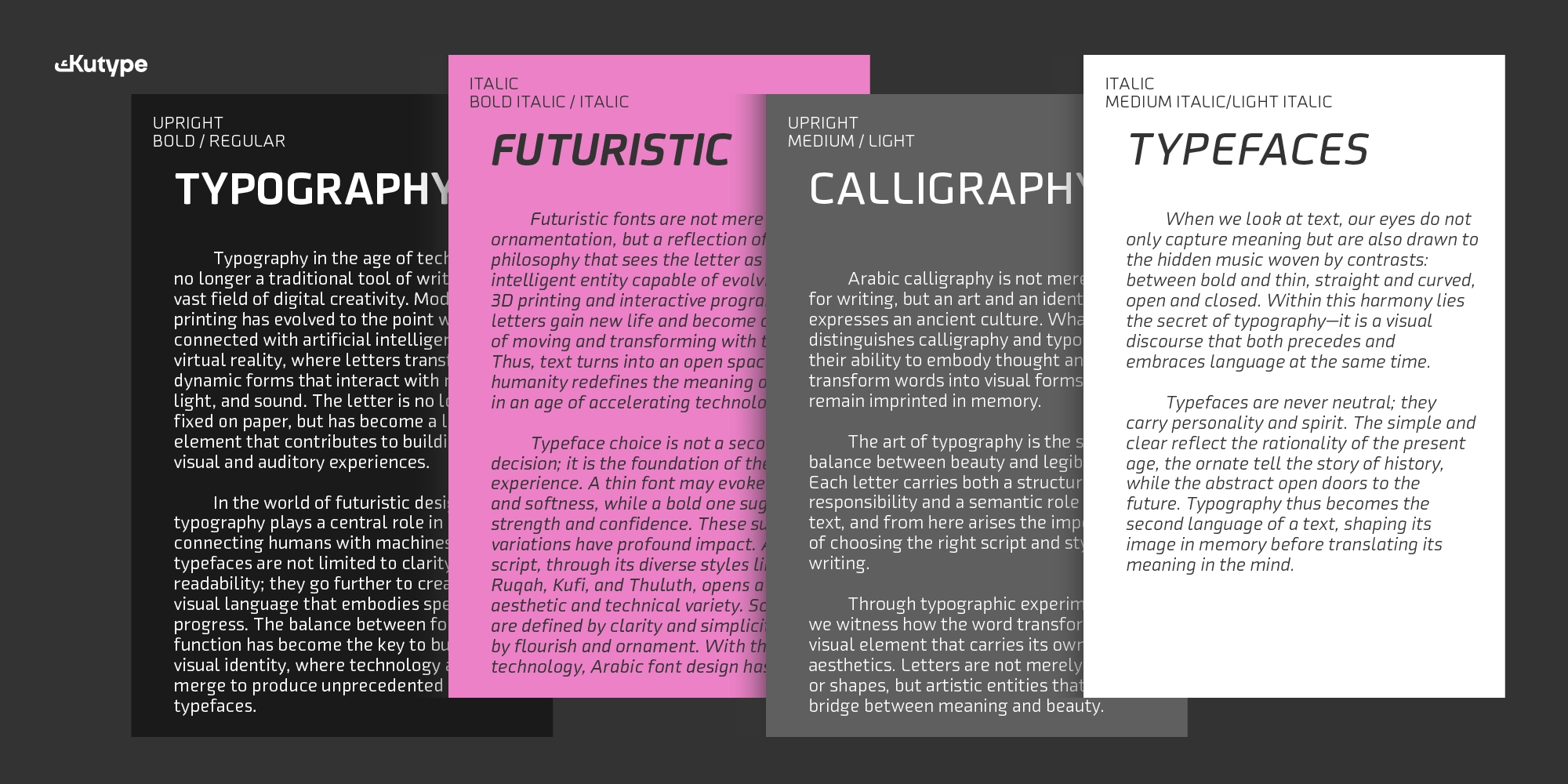
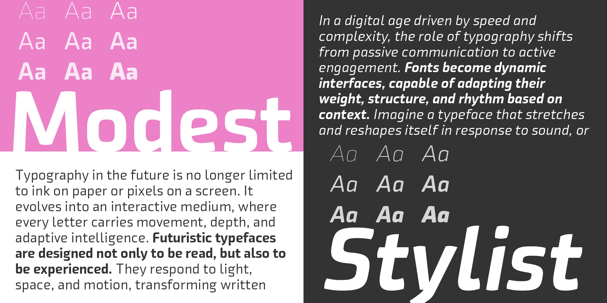
Ramis Semi-Geometric Sans Typeface is designed as a flexible system suitable for hierarchy in digital design. Its structure supports various typographic needs, from small UI labels to larger headlines, while maintaining visual consistency.
Character Details & Alternates
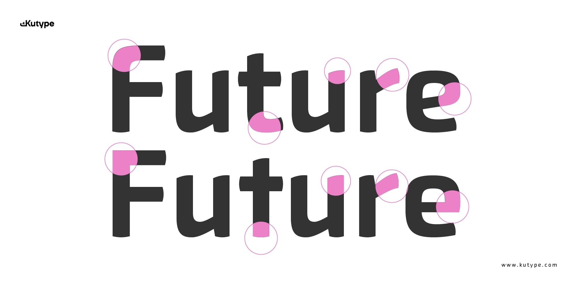
One of Ramis’ defining features lies in its stylistic alternates (ss01). Several uppercase characters, such as B, E, F, L, P, and R, offer sharper, more angular alternatives compared to the default curved forms. This gives designers the option to shift the tone from friendly to more technical or assertive when needed.
In lowercase, alternate forms are available for “a” and “g” in single-storey styles, offering a more contemporary and minimal look, especially useful in UI and digital branding contexts.
OpenType Feature
Ramis Semi-Geometric Sans Typeface is designed to meet the demands of modern digital systems, with features that enhance both usability and flexibility:
- Stylistic Alternates (ss01), switch between curved and sharp character styles
- Optimized Kerning & Spacing, ensures readability across screen sizes
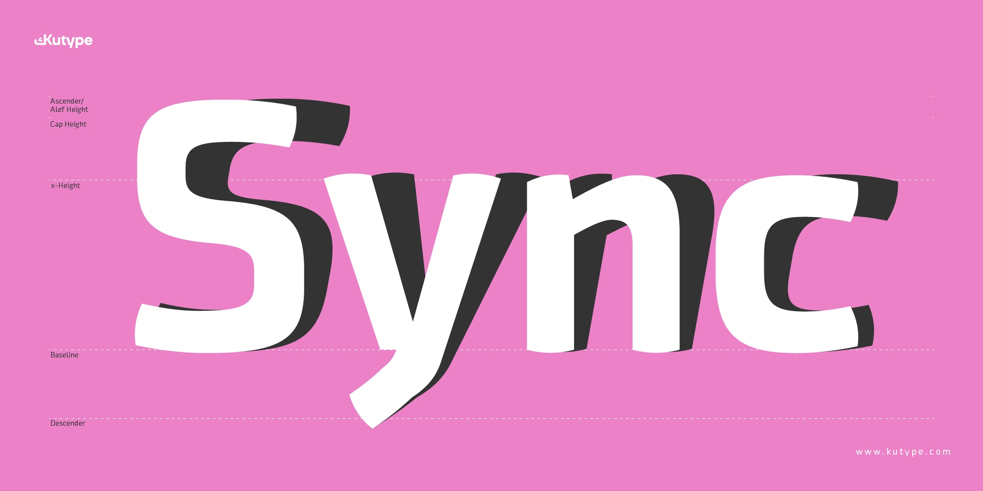
- Balanced Anatomy, carefully designed baseline, x-height, ascender, and descender for visual comfort
- Consistent Rhythm, smooth flow in both short and long text
- Bilingual Compatibility, designed to harmonize with Arabic counterparts
- Web & App Ready, optimized for UI, dashboards, and responsive layouts
Every detail, from the shape of counters to the spacing between letters, is refined to support clarity and reduce visual fatigue.
Ideal Use Cases
Ramis is built for environments where typography needs to perform consistently across platforms and languages.
- UI & Applications, its clean structure and readability make it ideal for interfaces, dashboards, and mobile apps where clarity is critical.
- Digital Branding, Ramis offers a modern and professional tone that works well for tech companies, startups, and digital-first brands.
- Web Design, optimized for screen use, it maintains legibility across devices and resolutions.
- Bilingual Systems, when paired with its Arabic counterpart, Ramis supports cohesive multilingual design systems, ensuring visual consistency across scripts.
- Corporate & Product Design, suitable for presentations, product interfaces, and brand guidelines that require a scalable and reliable type system.
Pair this Latin font with Ramis Arabic to create a balanced bilingual typography system.
Conclusion
Ramis Semi-Geometric Sans Typeface stands out by doing something deceptively difficult: balancing structure and softness, modernity and readability. As a semi-geometric sans-serif for tech, branding, and apps, it delivers a system that feels both professional and approachable.
With its thoughtful alternates, strong digital performance, and bilingual harmony, Ramis becomes more than just a typeface, it’s a practical design tool for teams building scalable, future-ready visual systems.
For designers working across UI, branding, and multilingual platforms, Ramis offers a clear advantage: a font that performs effortlessly while maintaining a refined, modern voice.
Font Name
Ramis
Designer
Nur Syamsi, Bustanul Arifin
Version
Build 1.0 - 2025
Type Category
Sans Serif, Semi-Geometric, Display
Glyph Count
607+
Year Published
September 2025
Supported Languages
Afrikaans, Albanian, Asturian, Asu, Basque, Bemba, Bena, Bosnian, Breton, Catalan, Cebuano, Chiga, Colognian, Cornish, Corsican, Croatian, Czech, Danish, Dutch, Embu, English, Esperanto, Estonian, Faroese, Filipino, Finnish, French, Friulian, Galician, Ganda, German, Gusii, Hungarian, Icelandic, Ido, Inari Sami, Indonesian, Interlingua, Irish, Italian, Javanese, Jju, Jola-Fonyi, Kabuverdianu, Kalaallisut, Kalenjin, Kamba, Kikuyu, Kinyarwanda, Kurdish, Latvian, Lithuanian, Lojban, Low German, Lower Sorbian, Luo, Luxembourgish, Luyia, Machame, Makhuwa-Meetto, Makonde, Malagasy, Malay, Maltese, Manx, Māori, Meru, Mohawk, Morisyen, North Ndebele, Northern Sami, Northern Sotho, Norwegian Bokmål, Norwegian Nynorsk, Nyanja, Nyankole, Occitan, Oromo, Polish, Portuguese, Quechua, Romanian, Romansh, Rombo, Rundi, Rwa, Samburu, Sango, Sangu, Sardinian, Scottish Gaelic, Sena, Shambala, Shona, Sicilian, Slovak, Slovenian, Soga, Somali, South Ndebele, Southern Sotho, Spanish, Sundanese, Swahili, Swati, Swedish, Swiss German, Taita, Taroko, Teso, Tsonga, Tswana, Turkish, Turkmen, Upper Sorbian, Vunjo, Walloon, Walser, Welsh, Western Frisian, Wolof, Xhosa, Zulu
Ramis
112px
Ramis
54px
Ramis
20px
Buying Options
Total $0.00