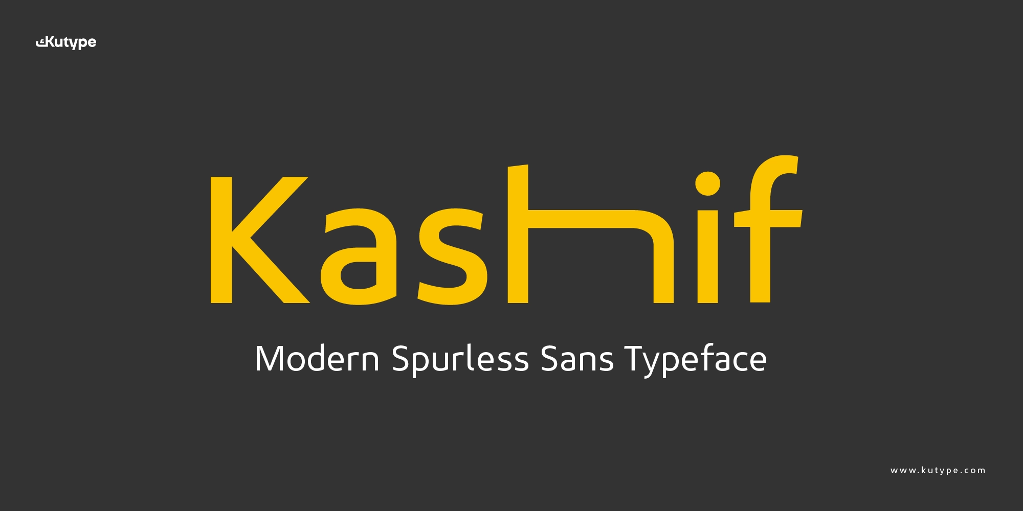
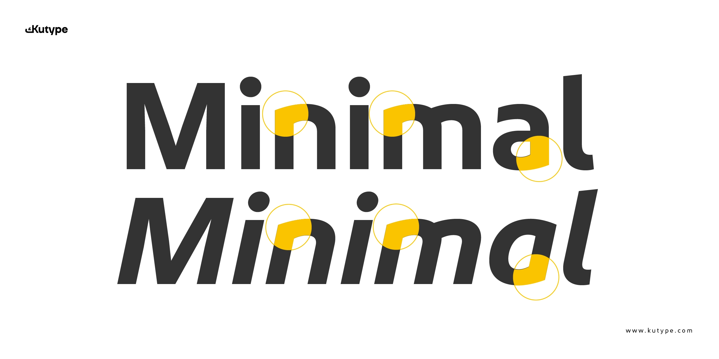
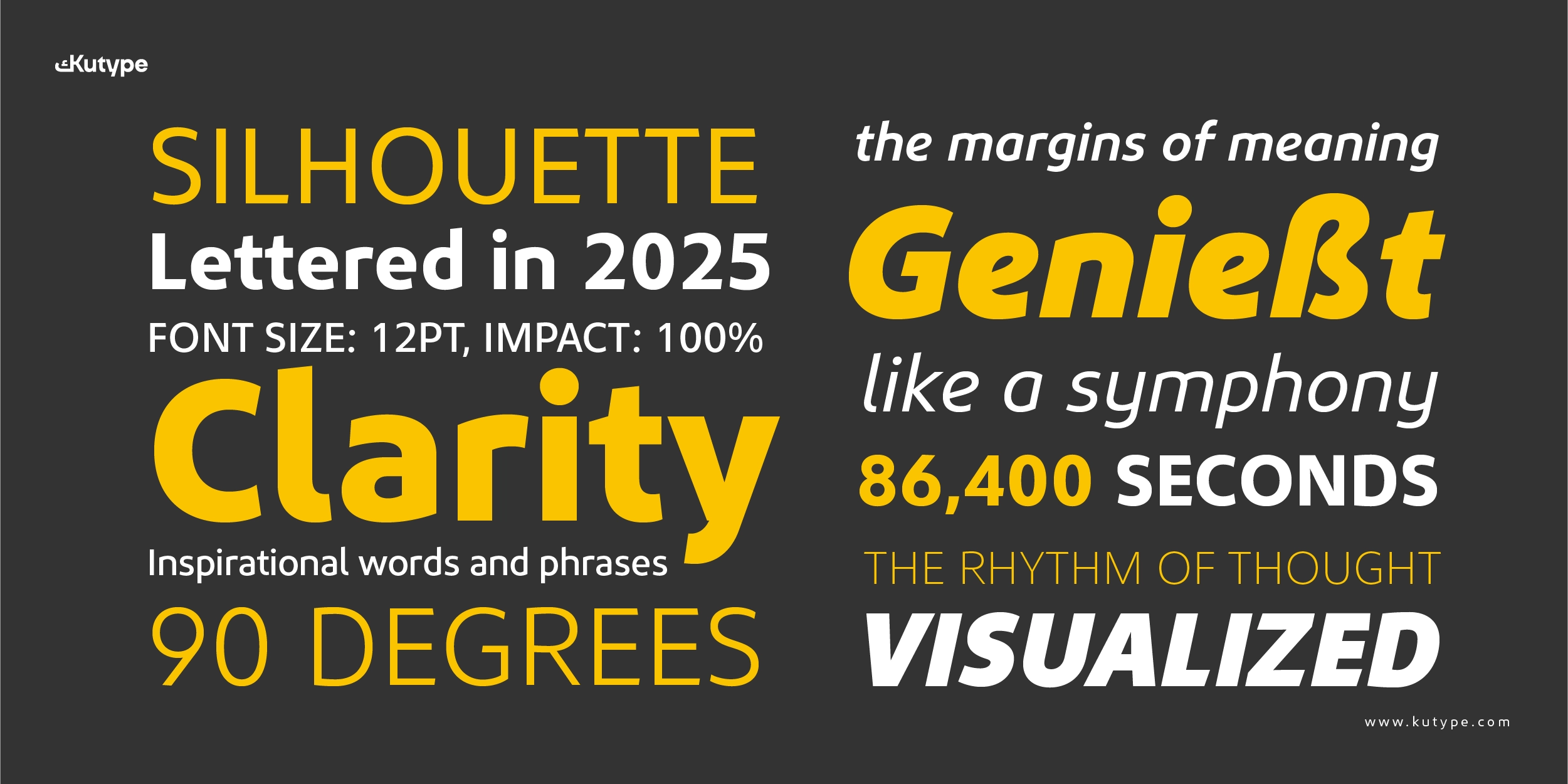
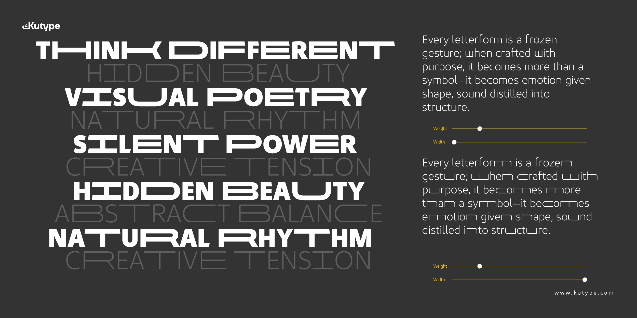
Kashif is a modern spurless sans serif typeface developed for contemporary branding and logo design. By removing spurs—small projecting strokes found in traditional grotesque structures—Kashif presents cleaner letterforms with a smoother visual flow. This spurless approach reduces visual noise and creates a refined appearance, making the typeface especially effective for brand identities that demand clarity and consistency.
Designed with modern visual communication in mind, Kashif balances geometric structure with organic movement. Its calm rhythm and open proportions help logos remain legible and recognizable across platforms, from digital screens to print applications. As a spurless font, Kashif communicates modernity, confidence, and precision—qualities that are essential in branding systems.
Background and Development
Kashif was designed by Nur Syamsi and Bustanul Arifin, with font presentation by Bustanul Arifin and Dhian Tri Antono. The project emerged from a growing need for spurless sans serif fonts that perform reliably in modern branding and digital environments.
As logos and brand systems increasingly live on screens—websites, apps, and social platforms—typefaces must remain clear at small sizes and flexible across layouts. Sans serif fonts have long been favored for these needs, and spurless constructions further enhance readability by simplifying letter endings. Kashif belongs to this functional tradition while introducing its own distinct character.
Early development took inspiration from Ubuntu, a well-known spurless typeface recognized for its warmth and simplicity. Kashif expands on this reference with slightly wider proportions and refined details, especially in the crossbars of the “f” and “t.” These choices add personality without compromising clarity, making the font well suited for logo and branding use.
Name Philosophy
The name Kashif carries the meaning of revealing—bringing form, meaning, and structure into clear view. This philosophy reflects the typeface’s design approach: focusing on essential shapes rather than decorative gestures.
In branding and logo design, typography must communicate clearly and confidently. Kashif supports this goal by offering forms that feel intentional, balanced, and well-constructed. The name reinforces Kashif’s role as a tool for designers who want their brand identity to appear sharp, direct, and thoughtfully designed.
Looking for a similar style? Explore Ramis as a great alternative with a comparable Geometric Sans aesthetic.
Design Details and Structure
Unlike Tafkir, which has a geometric sans serif approach, Kashif font is built on balanced proportions and a stable typographic framework, ensuring consistency across different branding applications. Subtle stroke contrast, clean terminals, and careful spacing create a crisp texture that remains comfortable to read while maintaining a strong visual presence.
The spurless structure allows letterforms to feel smoother and more contemporary, which is particularly valuable in logos where every detail is visible and impactful. Slightly wider metrics give brand names room to breathe, helping logotypes appear open, modern, and confident.
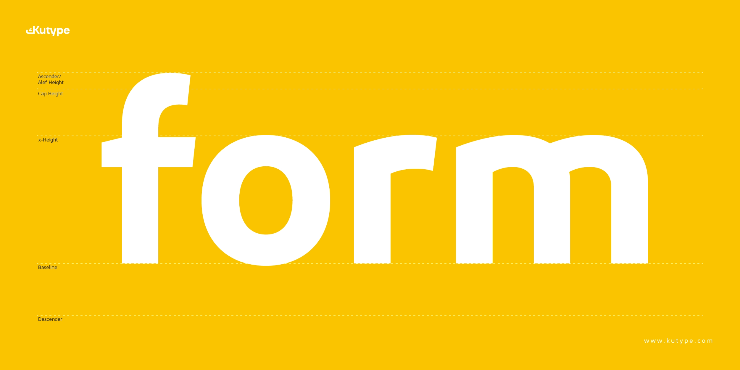
Like all professional typefaces, Kashif is shaped through typographic anatomy—baseline, x-height, ascenders, and descenders—while elements such as stems, counters, and crossbars define its personality. These details ensure that Kashif performs reliably in both short brand marks and extended brand systems.
Variable and OpenType Features
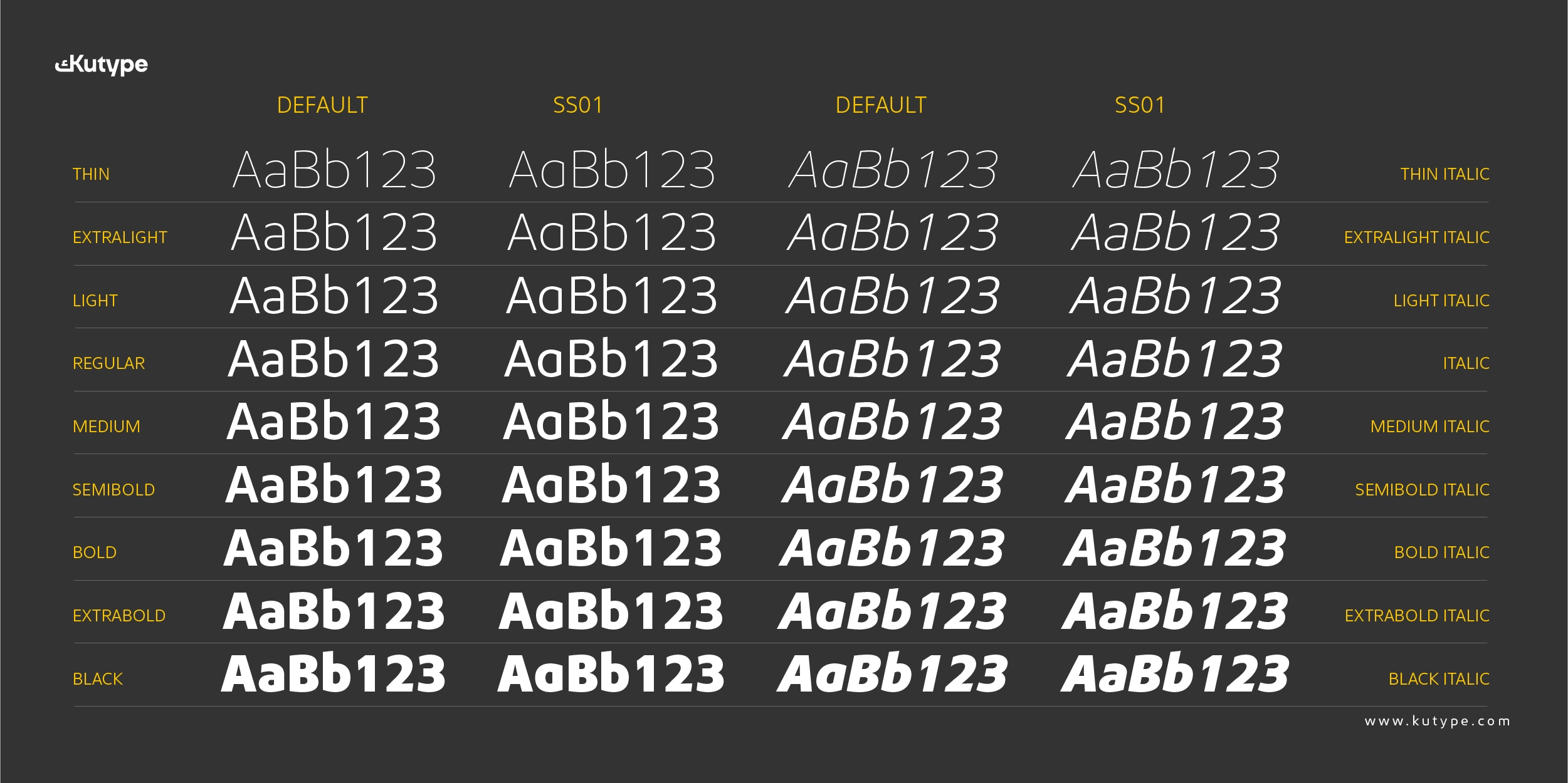
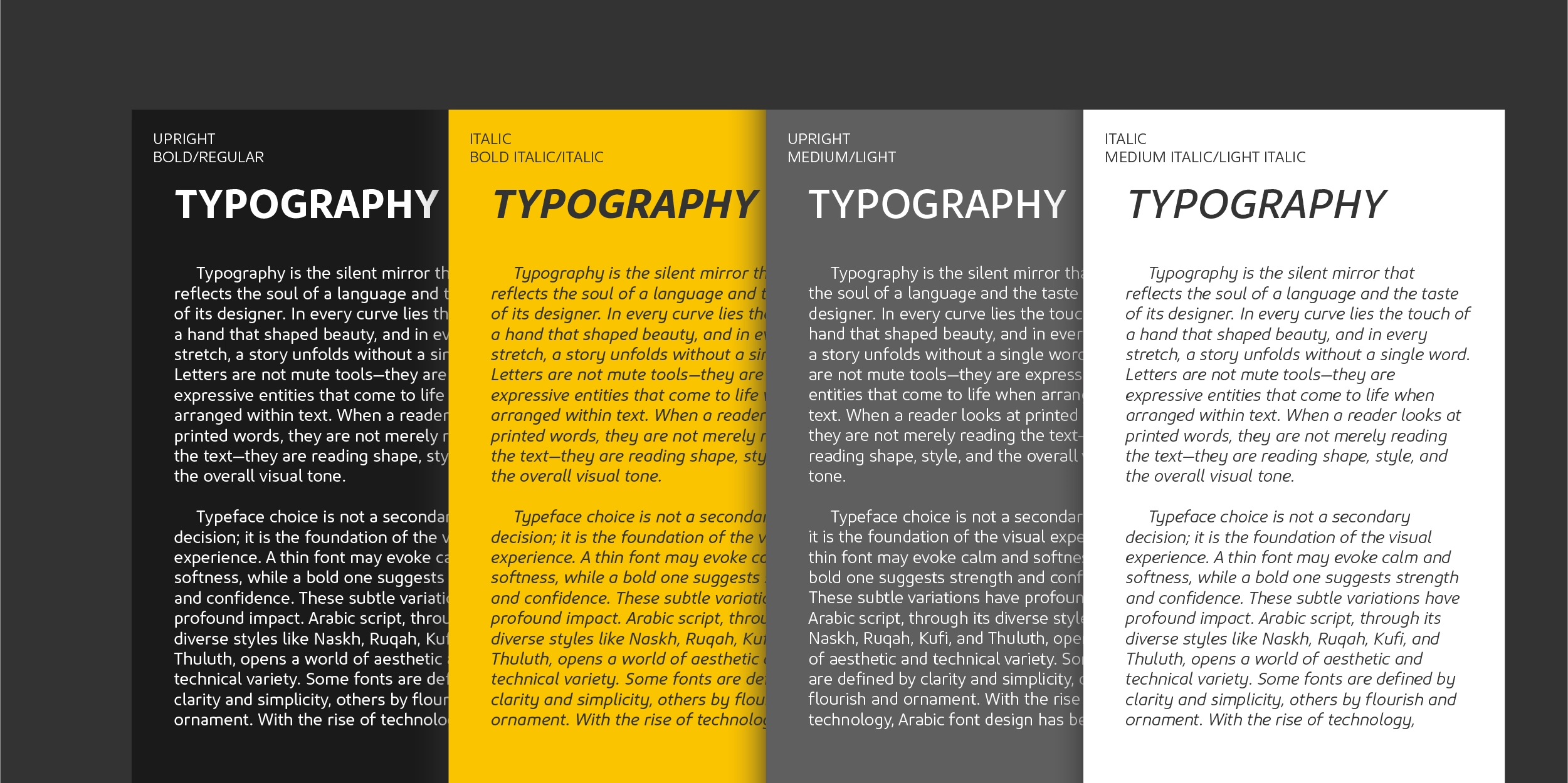
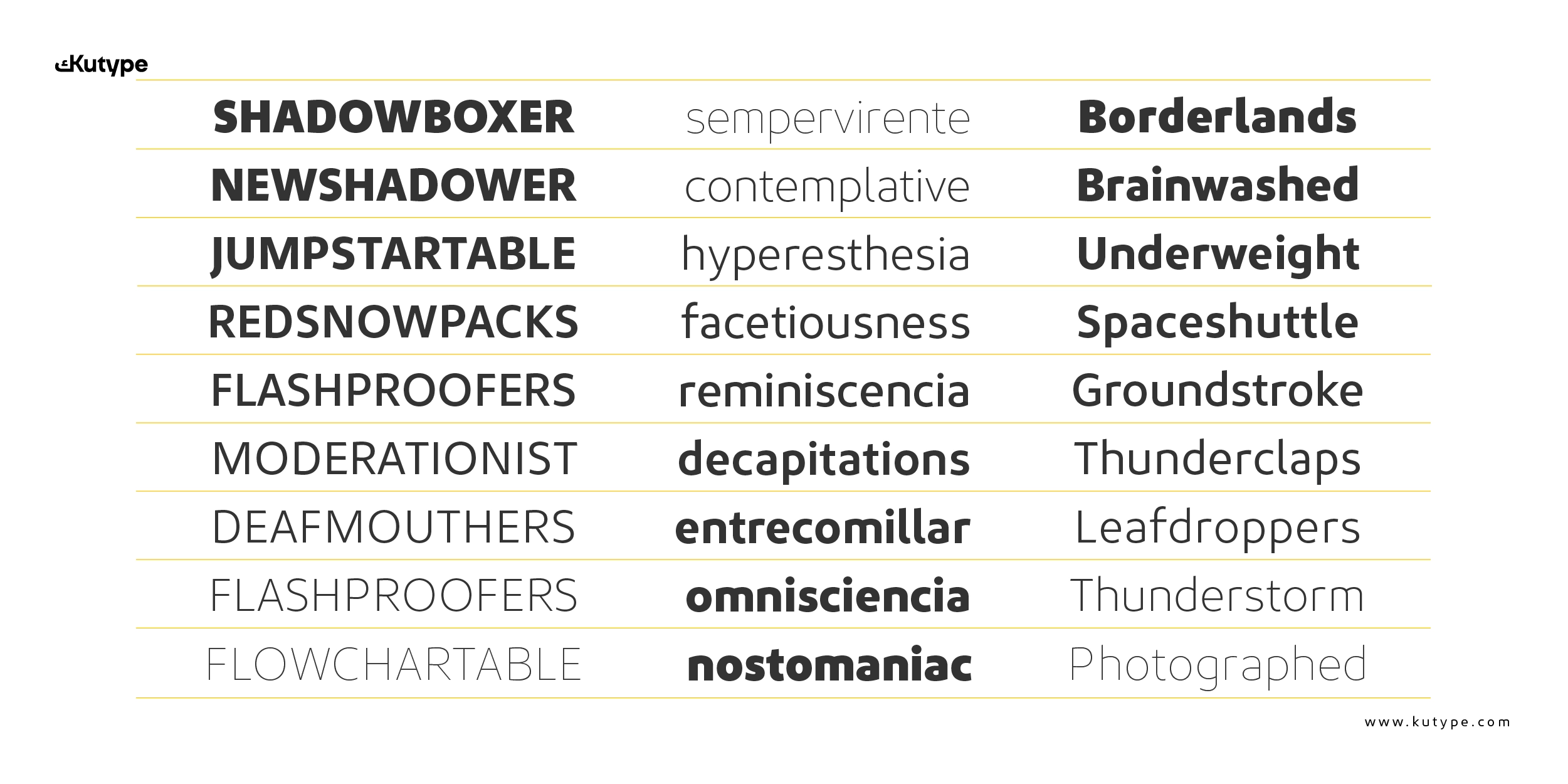
Kashif font is available in 18 styles, ranging from Thin to Black, including italics. It also includes a variable font, offering flexible weight control for responsive branding and logo systems.
A distinctive feature of Kashif’s variable version is the ability to extend selected characters to meet specific visual needs. Extendable characters include B, C, D, E, F, H, I, K, O, P, R, T, U, as well as c, h, m, n, u, w. This flexibility allows designers to fine-tune wordmarks and logotypes without breaking consistency.
To support professional branding workflows, Kashif includes essential OpenType features, such as ligatures, contextual alternates, stylistic sets, fractions, ordinals, subscript and superscript, case-sensitive forms, and localized forms. These features help refine typography while keeping brand visuals clean and cohesive.
Use Cases: Branding and Logo Design
Kashif is purposefully positioned as a spurless font for branding and logo design. Its clean construction and simplified letter endings make logos easier to recognize and more consistent across different sizes and media.
In logo design, spurs can introduce visual clutter, especially at small scales or on screens. Kashif’s spurless letterforms eliminate this issue, resulting in logos that feel sharper, more stable, and more contemporary. This makes the font suitable for startups, tech companies, creative studios, and modern brands seeking a confident visual identity.
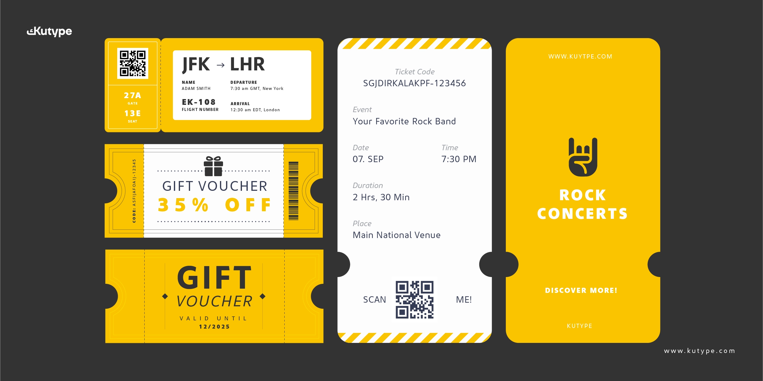
The combination of balanced geometry, subtle detailing, and flexible weights allows Kashif to function beyond the logo itself. It supports full branding systems, including headlines, taglines, brand typography, and digital interfaces, ensuring a unified brand voice across platforms.
Pair this Latin font with Kashif Arabic to create a balanced bilingual typography system.
Conclusion
Kashif is a modern spurless sans serif font designed with branding and logo design at its core. Clean, balanced, and highly legible, it offers designers a reliable typographic foundation for building strong and recognizable brand identities.
With its refined structure, flexible variable features, and professional OpenType support, Kashif delivers clarity without losing character. It is a typeface that feels confident without being loud—an ideal choice for brands that want to communicate modernity, precision, and trust through typography.
Discover more about Kashif and start using it today at Kutype.