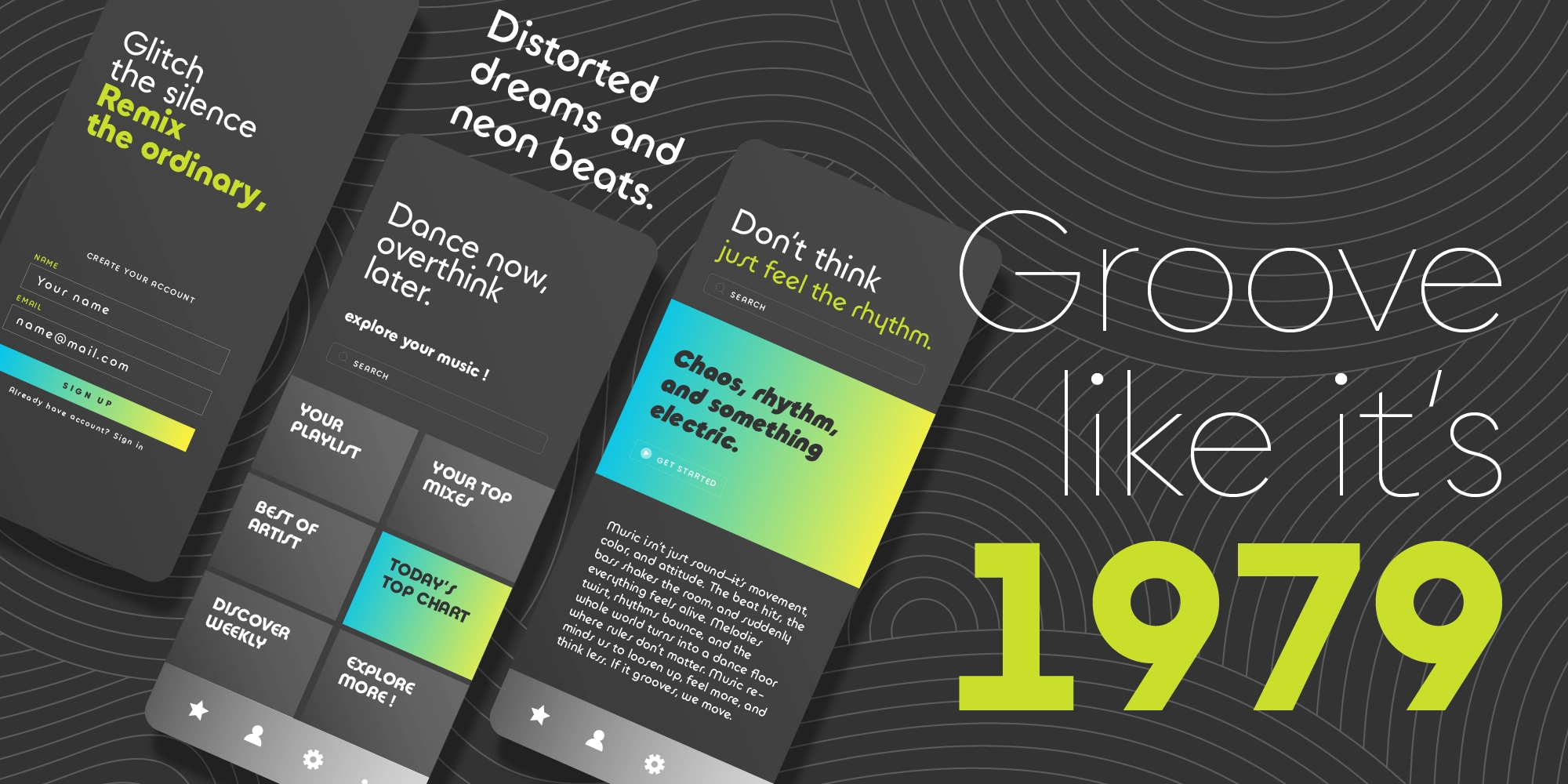
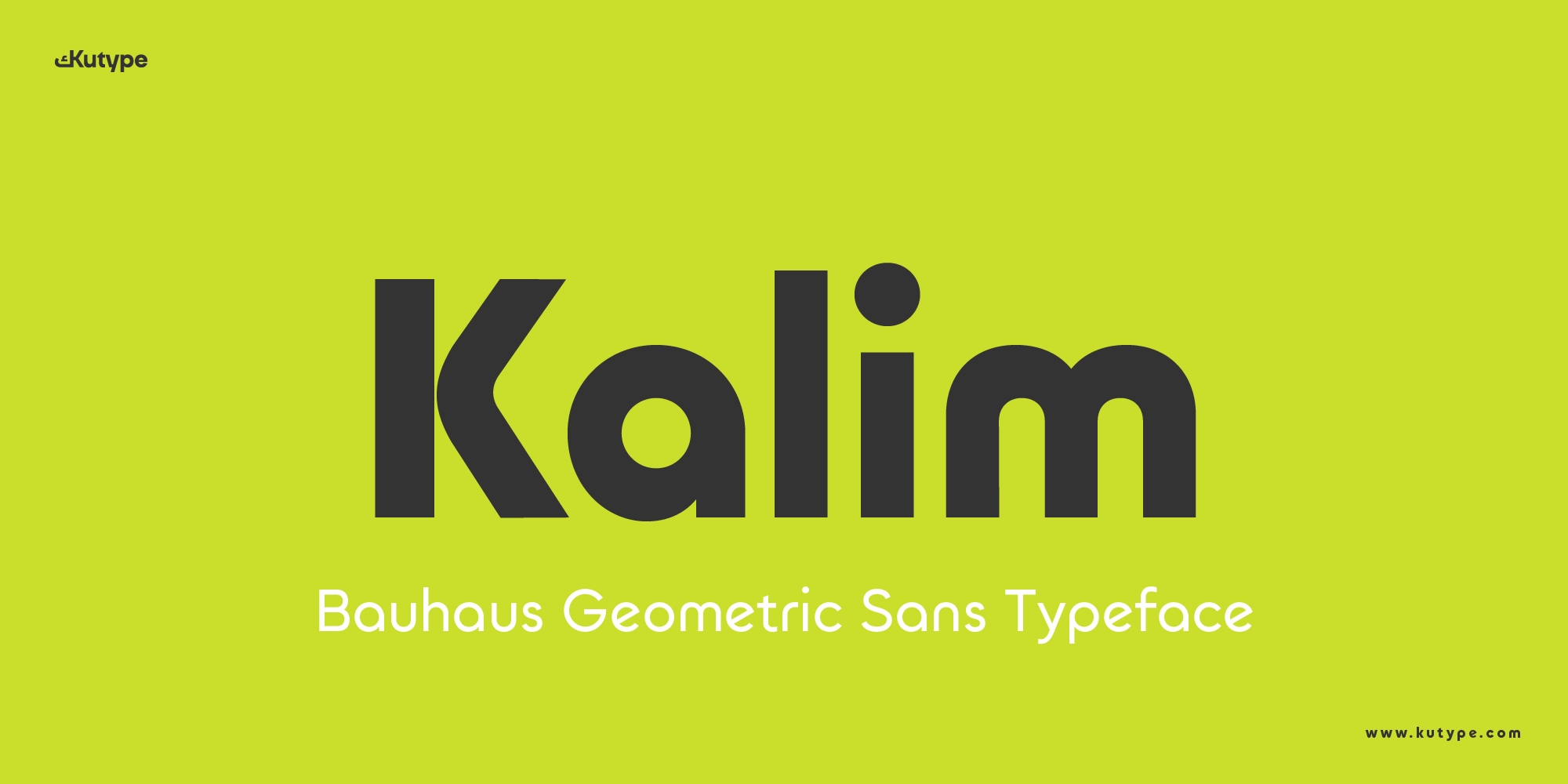
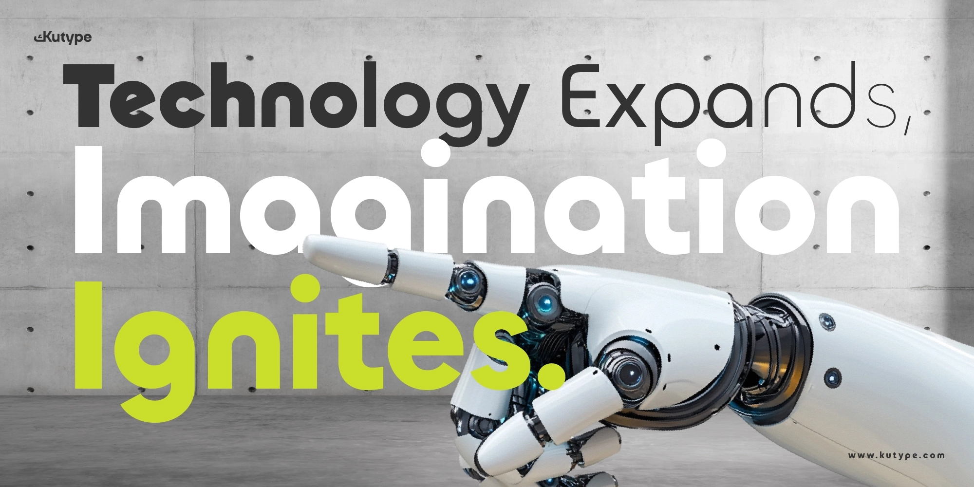
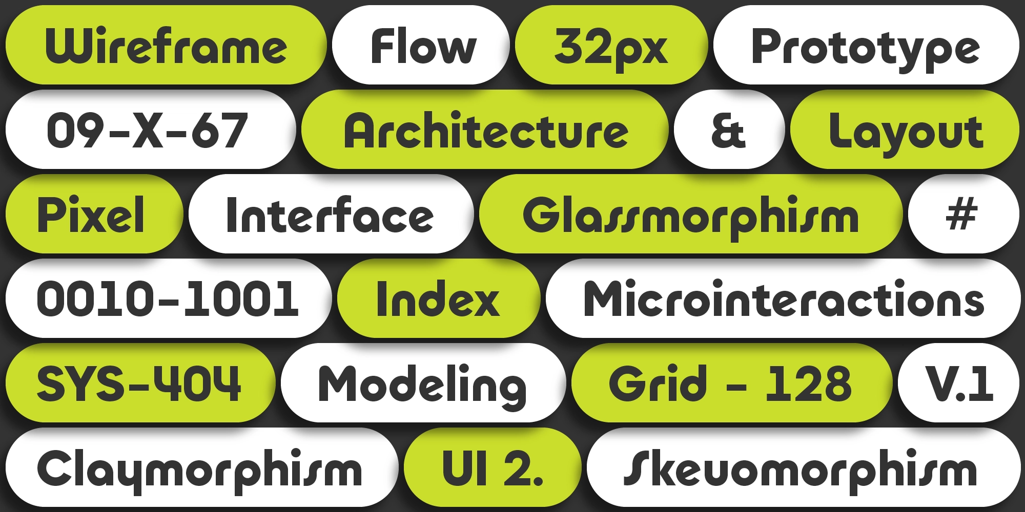
In today’s digital landscape, typography needs to do more than just look good, it needs to communicate clearly, scale across platforms, and carry a strong visual identity. Kalim Bauhaus Geometric Sans font is designed with exactly that purpose in mind. A Bauhaus-inspired geometric sans-serif built for futuristic branding, apps, and digital interfaces, it delivers a bold and structured voice that stands out in modern design systems.
With its solid construction and minimal contrast, Kalim is particularly effective in environments where clarity and consistency are essential, such as UI, dashboards, and web interfaces. At its core, Kalim promises a typeface that is strong, communicative, and built for the demands of the digital era.
Background & Philosophy
The name Kalim (كَالِم) originates from the Arabic root k-l-m, which relates to speaking or communicating. This meaning directly informs the design philosophy behind the typeface: to create a font that communicates clearly and effectively, especially in UI contexts where readability and clarity are critical.
Kalim draws heavy inspiration from the Bauhaus design movement, known for its emphasis on simplicity, function, and geometric purity. This influence is clearly reflected in its construction, where circles, straight lines, and clean forms come together to create a visually stable system.
A key reference point is ITC Bauhaus, a classic geometric typeface that embodies symmetry and structural clarity. Kalim builds on this foundation while adapting it for contemporary use, making it more suitable for digital interfaces and modern branding needs.
Love the look of this typeface? Try Tafkir for another elegant take on the Geometric Sans style.
Key Design Characteristics
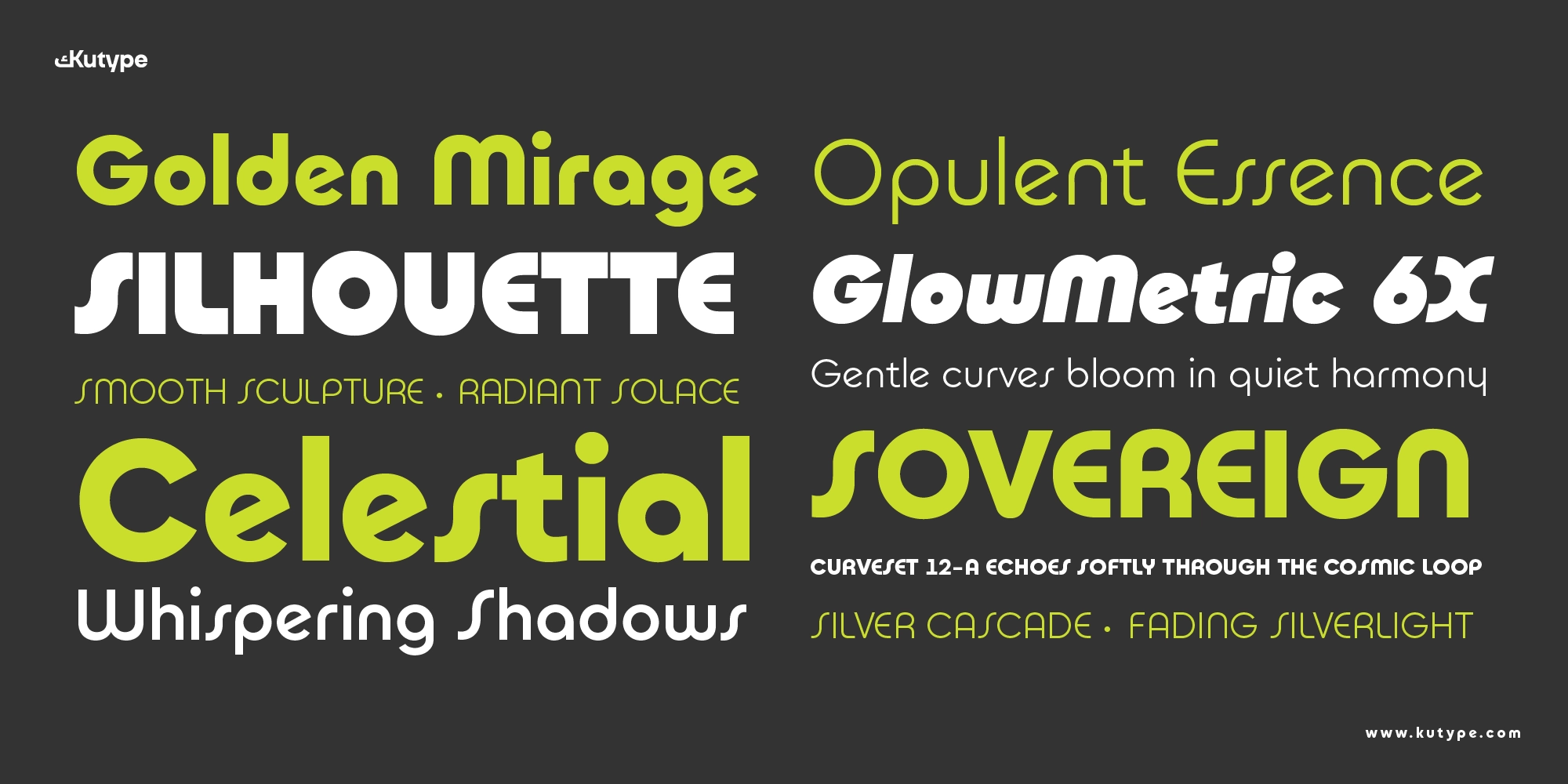
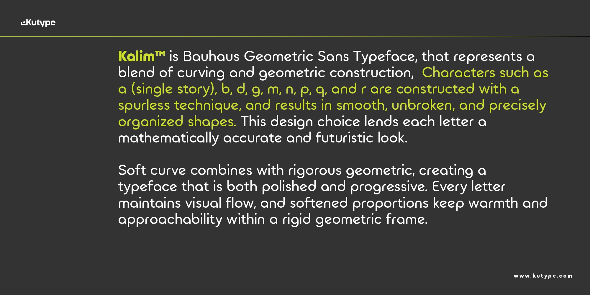
Kalim Bauhaus Geometric Sans font belongs to the spurless geometric sans-serif category, characterized by its clean terminals, uniform strokes, and highly structured forms. The absence of spurs contributes to a smoother and more minimal appearance, reinforcing its modern and futuristic tone.
The letterforms are defined by:
- Pure geometric shapes, circles and straight lines dominate the construction
- Monoline strokes, consistent thickness across all characters
- Very low contrast, ensuring clarity on screens
- Symmetrical structure, creating a stable and balanced visual rhythm
This combination results in a typeface that feels solid, confident, and highly legible, especially in digital environments.
Weight Range & Styles
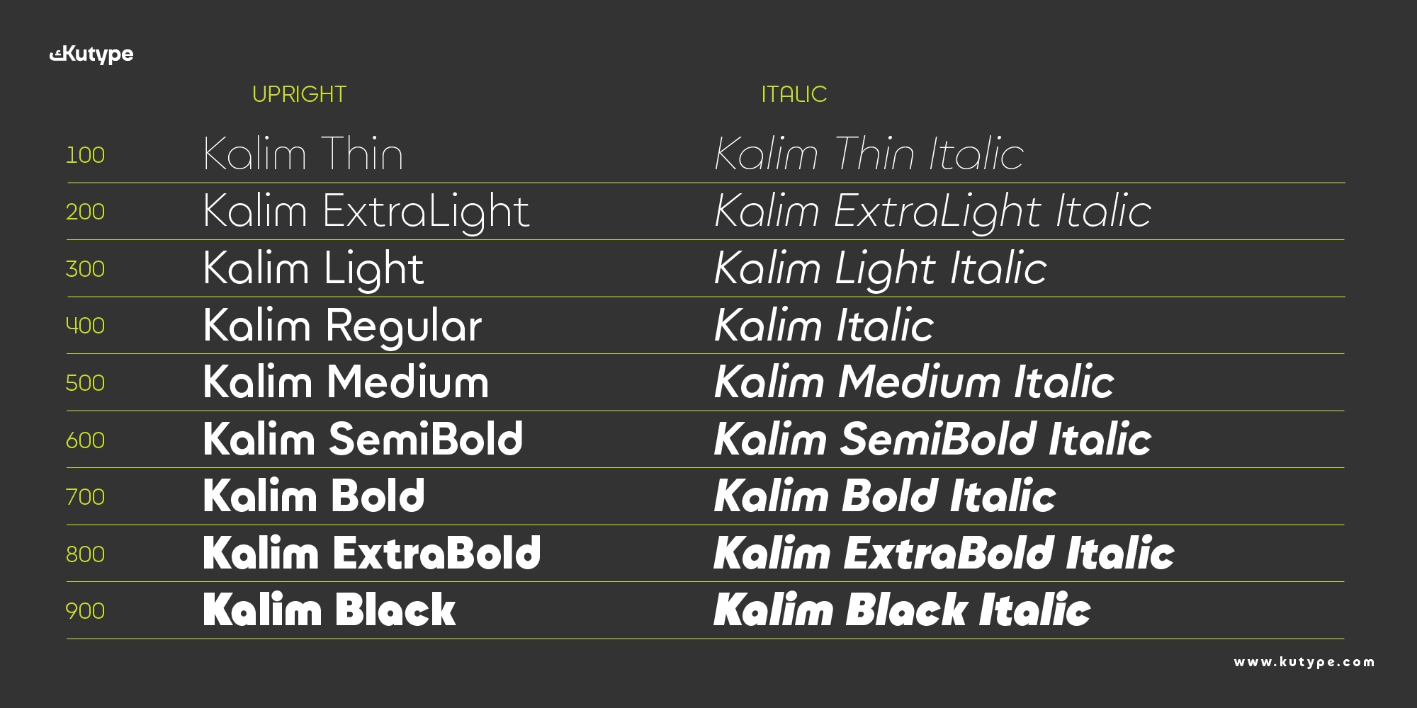
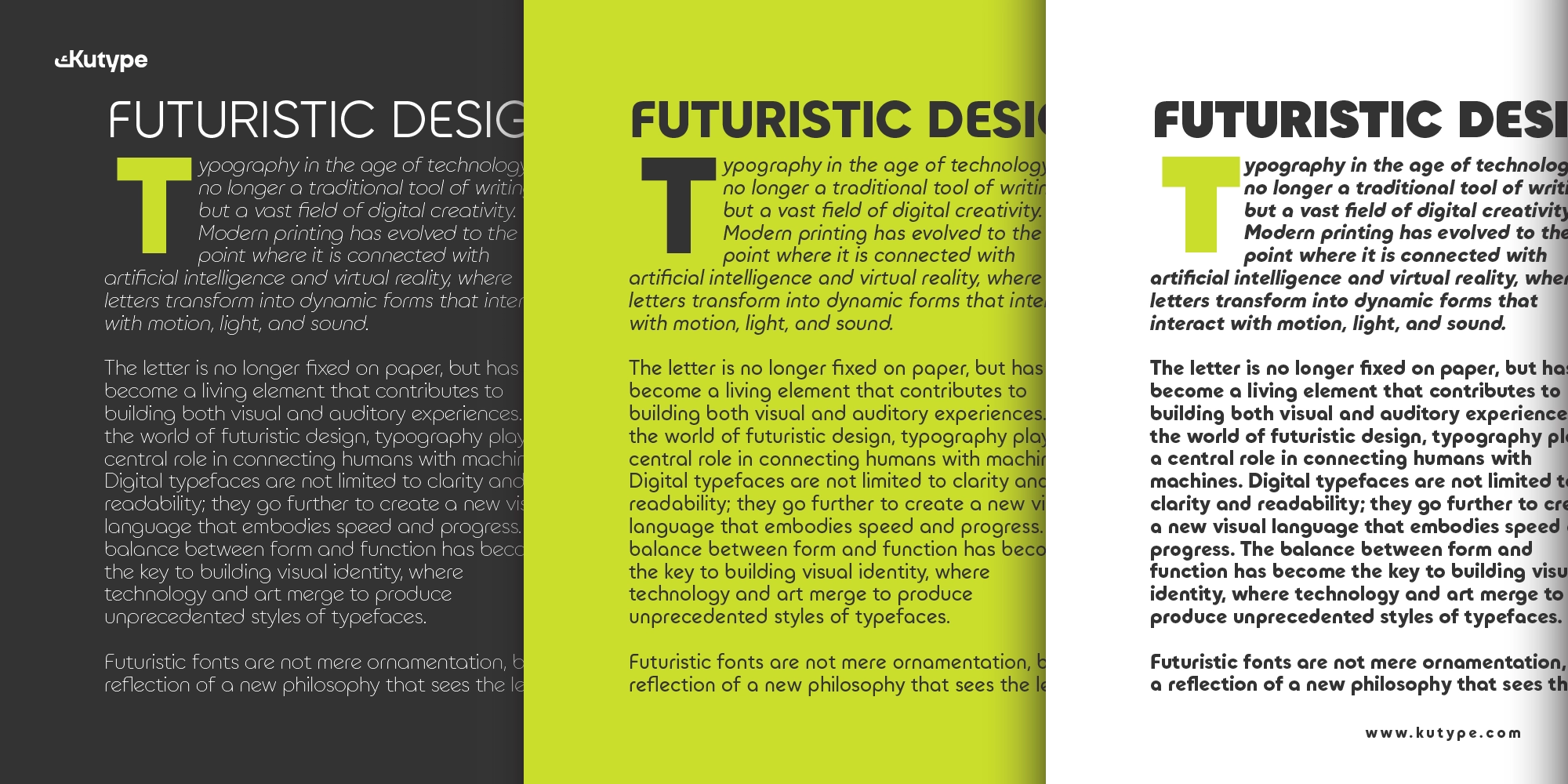
Kalim Bauhaus Geometric Sans font comes in a 9-weight system, ranging from Thin to Black, allowing designers to build clear hierarchy across different use cases, from subtle UI text to bold display headlines.
Stylistic Alternates
Kalim offers two distinct stylistic sets that expand its creative flexibility:
- ss01, explores more conventional geometric forms, emphasizing clarity and structure
- ss02, introduces more curvy, Bauhaus-inspired shapes, adding a softer and more expressive tone
These alternates allow designers to adjust the personality of the typeface depending on the project, whether aiming for a strict, modern look or a more playful geometric feel.
Opentype Features
Kalim is designed to support modern digital workflows with features that enhance both usability and visual impact:
- Strong Geometric Identity, ideal for bold and futuristic branding
- High Readability, clear letterforms optimized for screens
- Monoline Consistency, ensures visual stability across sizes
- Stylistic Alternates (ss01 & ss02), flexible expression within one type system
- Optimized Kerning & Spacing, improves readability in UI and display use
- Web & App Ready, performs reliably across responsive interfaces
Every detail, from its x-height to spacing rhythm, is carefully calibrated to ensure a smooth reading experience and consistent appearance.
Ideal Use Cases
Kalim is particularly effective in design scenarios that require a strong, modern, and structured typographic voice.
Branding & Identity, its bold geometric construction makes it ideal for brands that want to appear innovative, confident, and future-oriented.
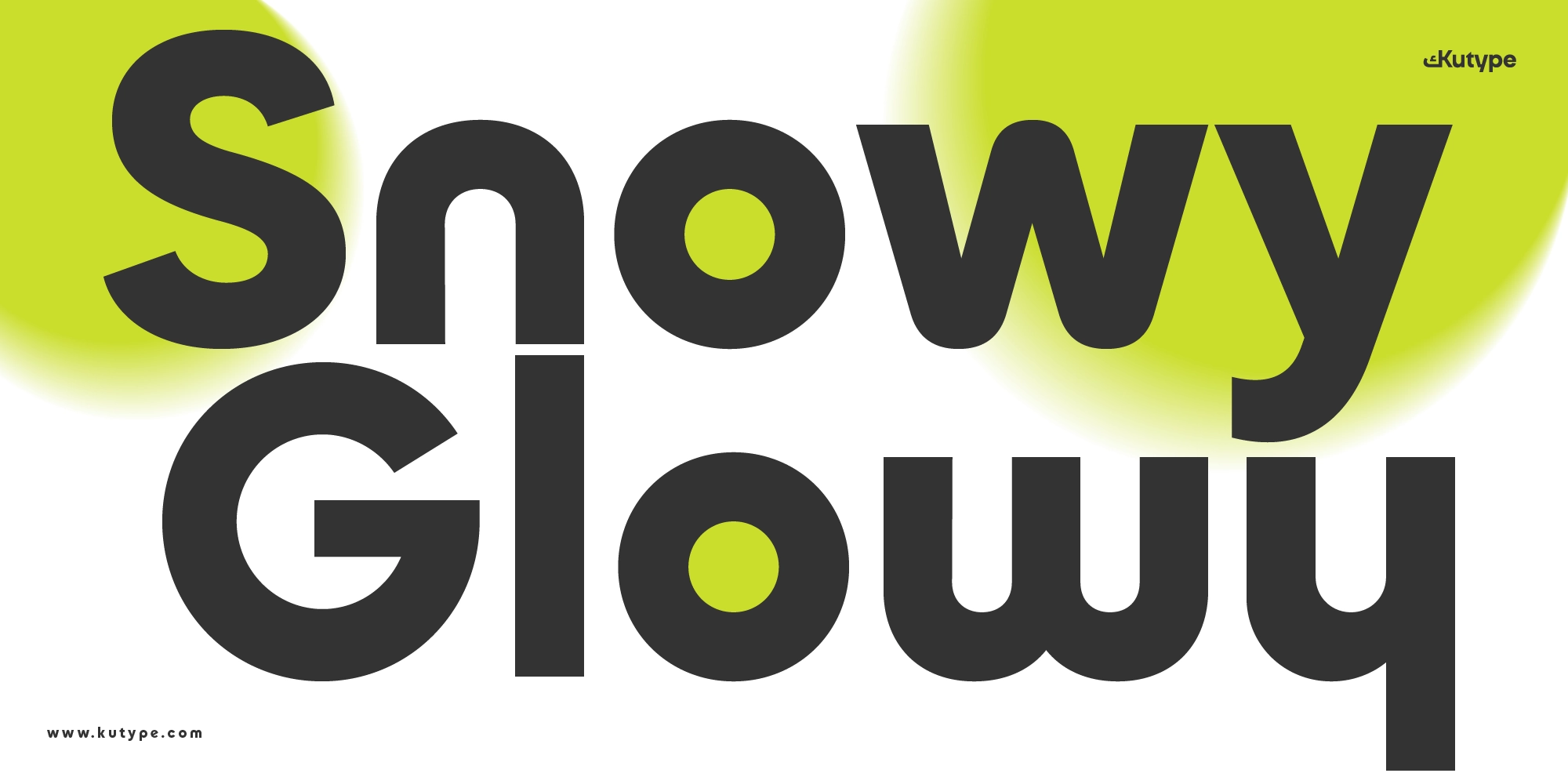
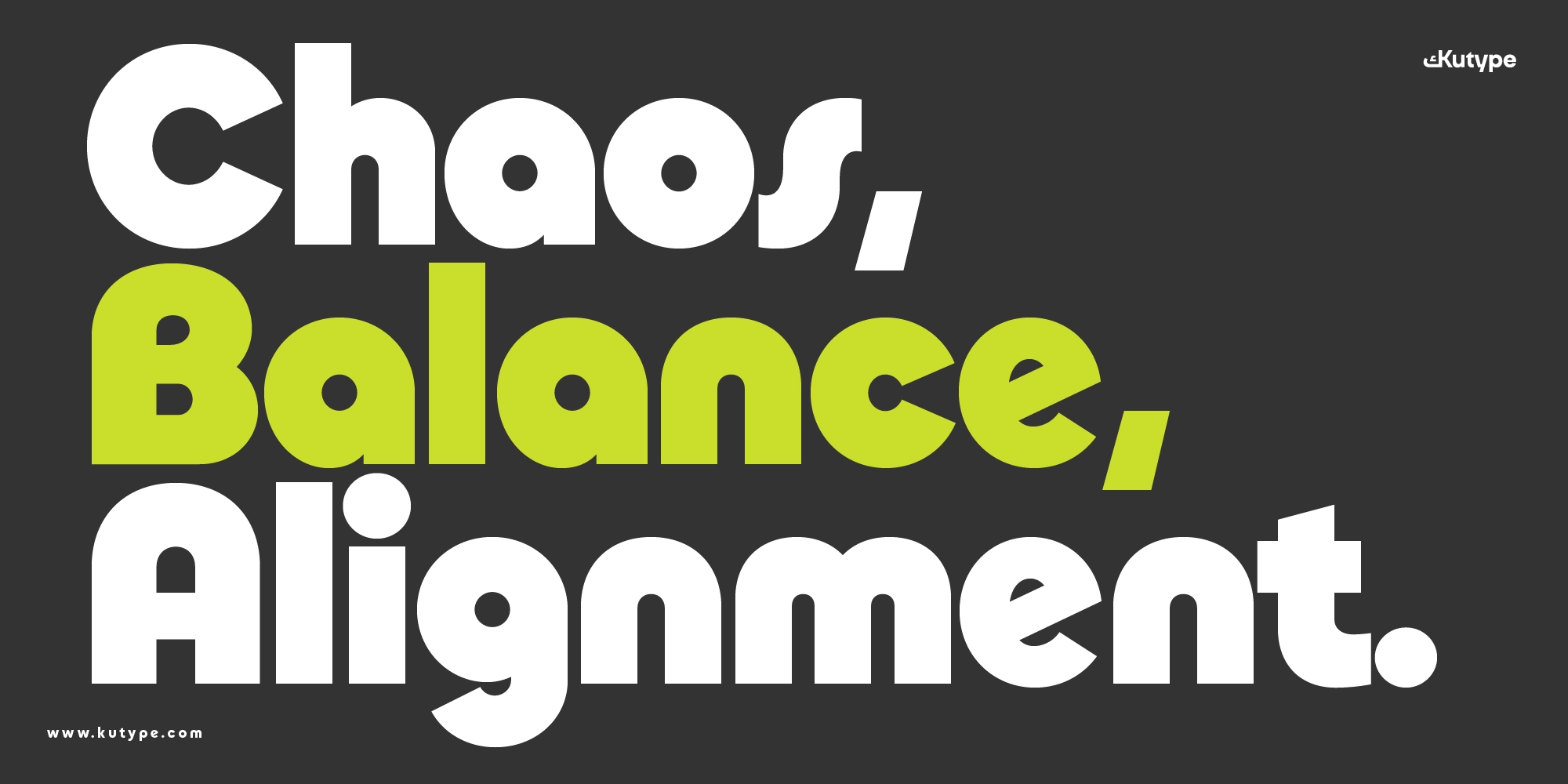
Display & Headlines, Kalim excels in large sizes, where its shapes can fully express their character and visual impact.
UI & Applications, while best suited for headlines, its clarity and consistency also support interface design, especially in dashboards and digital products.
Web & Digital Platforms, optimized for screen use, it maintains legibility across devices and resolutions.
Tech & Startup Ecosystems, perfectly aligned with industries that prioritize modernity, structure, and scalability.
Pair this Latin font with Kalim Arabic to create a balanced bilingual typography system.
Conclusion
Kalim Bauhaus Geometric Sans font stands as a strong representation of how Bauhaus principles can be reinterpreted for the digital age. By combining geometric precision, monoline structure, and futuristic character, it delivers a typeface that feels both timeless and forward-looking.
With its 9-weight system, flexible stylistic alternates, and solid visual identity, Kalim is more than just a geometric sans, it’s a reliable design tool for creating impactful branding and scalable digital systems.
For designers working on futuristic branding, apps, and modern interfaces, Kalim offers exactly what its name suggests: a typeface that communicates clearly, confidently, and effectively.