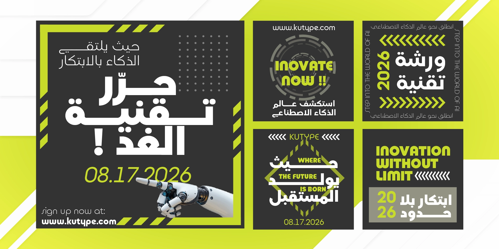
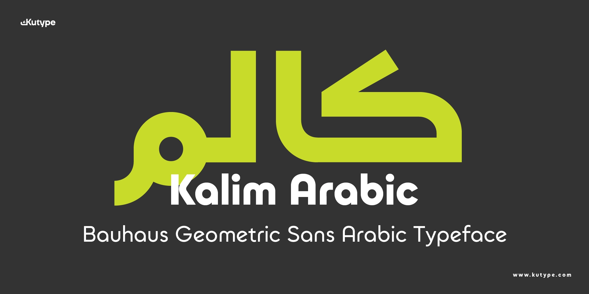
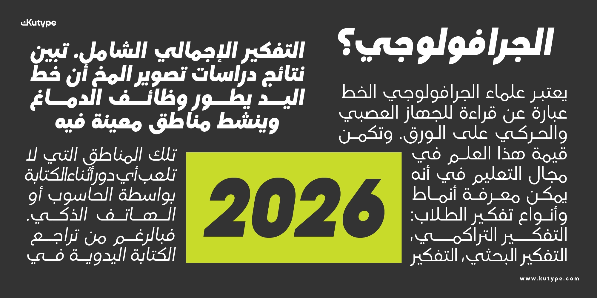
In multilingual digital design, consistency is everything. A typeface must not only perform well in one script but also maintain harmony across languages and platforms. Kalim Arabic is designed to meet that demand. A Bauhaus-inspired, modern Kufic typeface, it brings a strong geometric identity into Arabic typography for branding, apps, and digital interfaces.
Built as a bilingual system alongside its Latin counterpart, Kalim Arabic Bauhaus Geometric Sans Arabic Font focuses on clarity, structure, and visual consistency. It is particularly suited for UI, websites, and digital branding, where typography must scale seamlessly while maintaining a bold and modern tone.
At its core, Kalim Arabic delivers a clear promise: a solid, communicative typeface that bridges Latin and Arabic with strong visual harmony.
Design Inspiration & Naming
The name Kalim (كَالِم) comes from the Arabic root k-l-m, meaning to speak or to express. In this context, Kalim can be understood as “the one who speaks” or “the conveyor of words.” This idea reflects the essence of typography itself, communication through form.
Kalim Arabic builds on this philosophy by turning language into a structured visual system. It emphasizes the connection between thought, language, and expression, making it especially relevant for digital interfaces where clarity is key.
From a design perspective, Kalim Arabic draws from two major influences. On the Latin side, it adopts Bauhaus principles, known for geometric purity and functional design. On the Arabic side, it is rooted in the simplification of early Kufic script, one of the oldest and most structured styles in Arabic typography.
This fusion creates a typeface that feels both historical and futuristic. Similar approaches can be seen in modern reinterpretations of Arabic typography, such as Arabic web typography practices, where designers adapt traditional forms for digital performance. The geometric clarity of Kufic itself, explored in historical discussions on Arabic calligraphy, makes it particularly suitable for structured, screen-based environments. Meanwhile, insights from modern Arabic type design processes highlight the importance of balancing structure and readability, a principle that Kalim Arabic strongly embodies.
Explore more Geometric Sans Arabic typefaces like Tafkir Arabic to expand your creative typography collection.
Key Design Characteristics
Kalim Arabic Bauhaus Geometric Sans Arabic Font belongs to the modern Kufic category, reinterpreted through a geometric and Bauhaus-inspired lens. The design focuses on clarity, symmetry, and structural consistency, key qualities for digital use.
The letterforms are defined by:
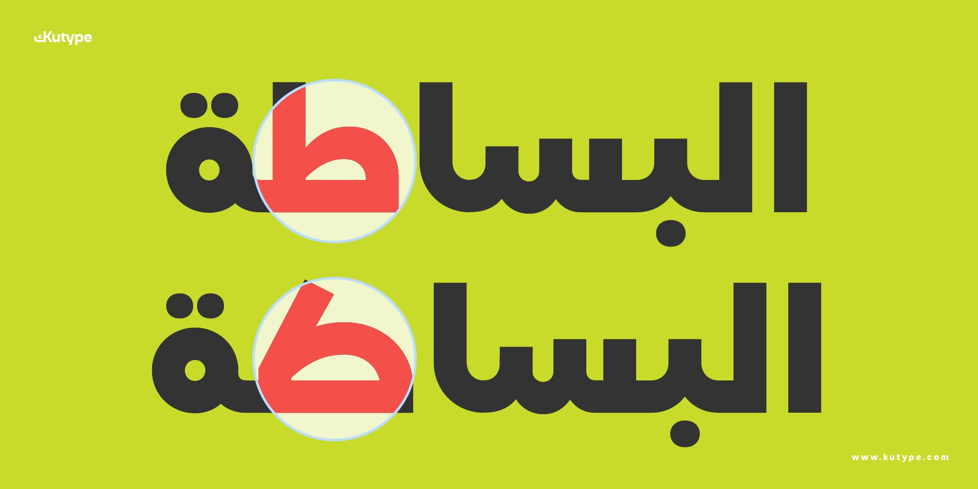
- Simplified Kufic structure, clean, geometric construction
- Spurless terminals, smooth, minimal endings that enhance modernity
- Monoline strokes, consistent thickness across characters
- Very low contrast, optimized for screen readability
This results in a typeface that feels solid, stable, and highly legible, especially in UI and display contexts.
Script Coverage
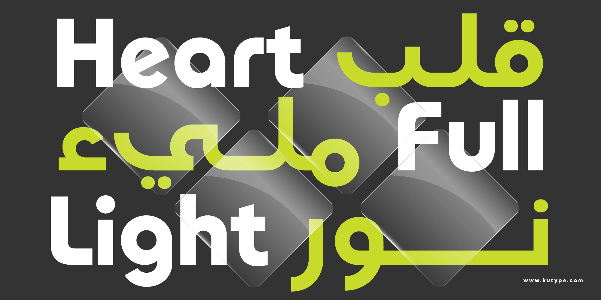
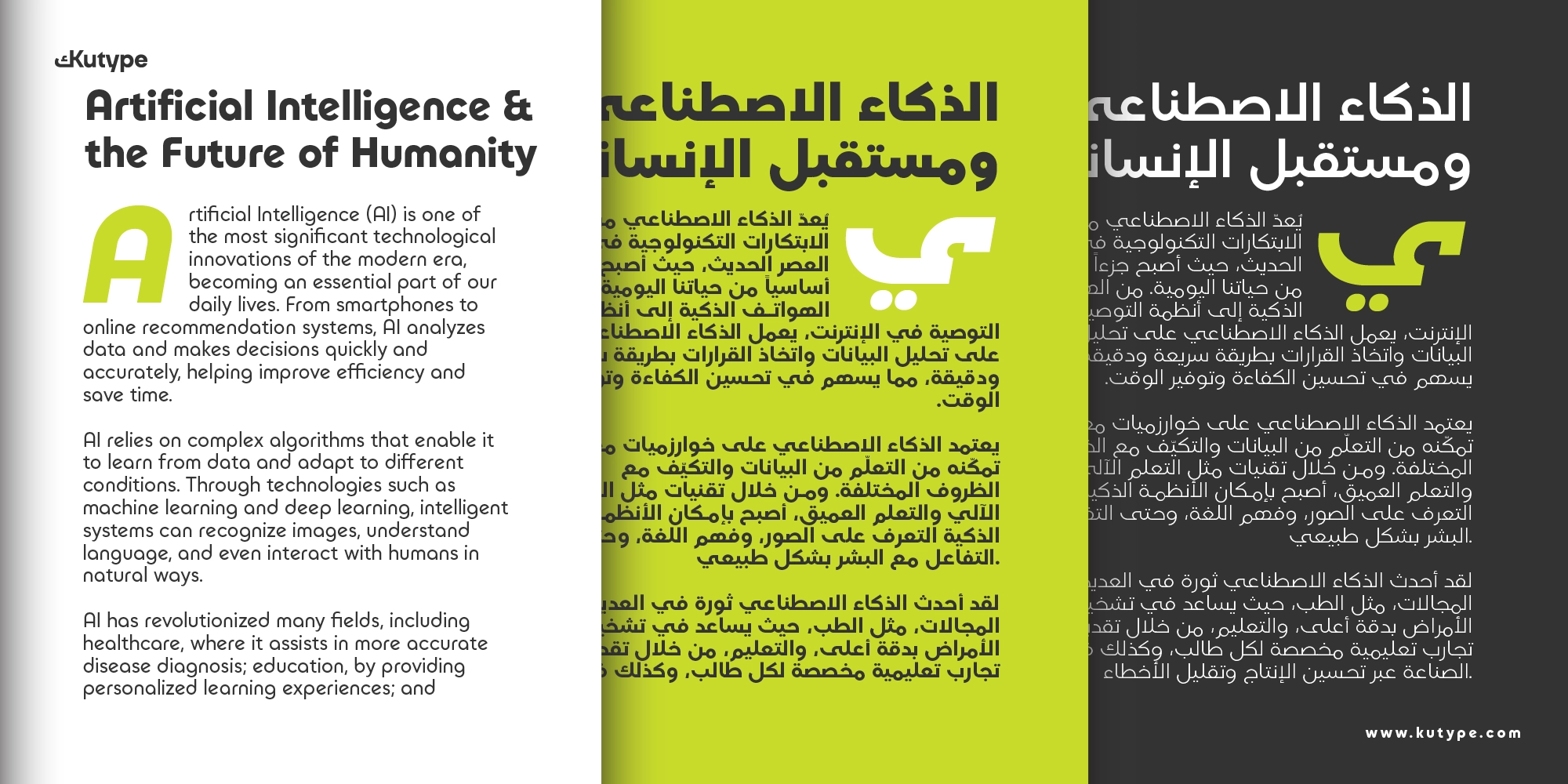
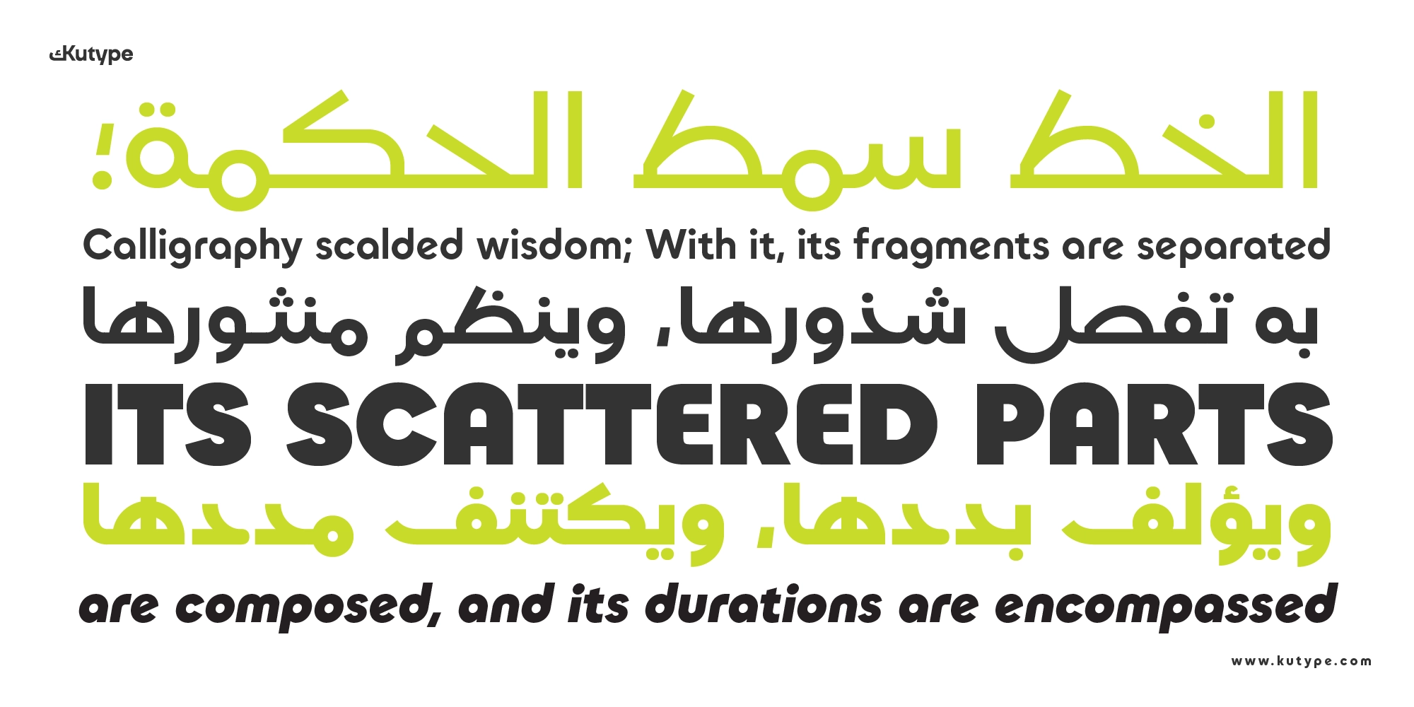
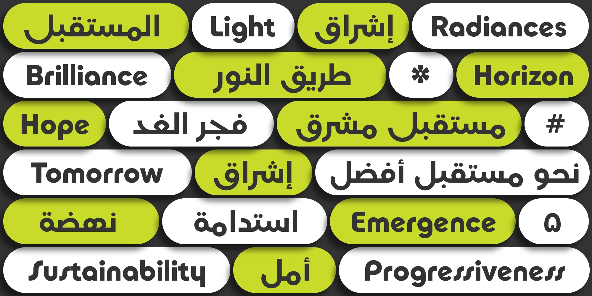
Kalim Arabic is designed as part of a bilingual system, ensuring strong harmony between Latin and Arabic scripts. This makes it particularly effective for multilingual branding and product design.
Weight Range & Styles
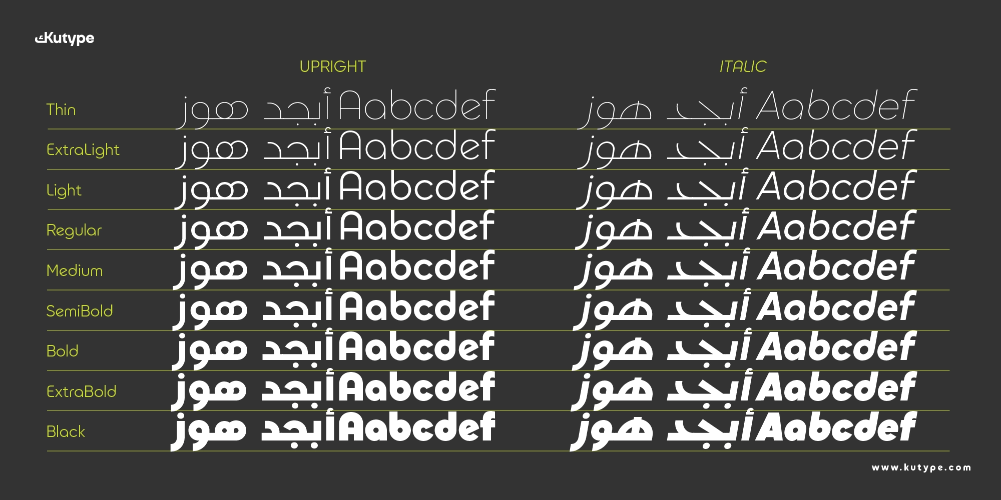
Kalim Arabic features a 9-weight system, ranging from Thin to Black (18 styles, 2 variable Fonts), allowing for flexible hierarchy across different design needs, from subtle interface text to bold headlines.
Kalim Arabic's Stylistic Alternates
- ss01 (Extended Forms), introduces wider, more expanded letterforms, adding a distinctive visual presence and flexibility for display use
Features at a Glance
Kalim Arabic Bauhaus Geometric Sans Arabic Font is engineered for modern digital environments, offering:
- Bilingual Script System, seamless integration between Latin and Arabic
- Strong Visual Harmonization, consistent tone across languages
- Geometric Kufic Structure, clear and structured letterforms
- High Readability, optimized for screens and digital interfaces
- Extended Alternates (ss01), added flexibility for creative expression
- Optimized Spacing & Kerning, ensures clarity and comfort in reading
- Web & App Ready, reliable performance across responsive platforms
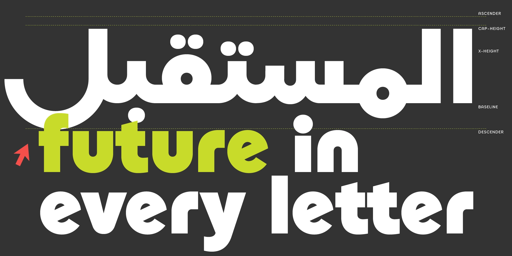
Every element, from baseline alignment to spacing rhythm, is carefully refined to ensure a cohesive and functional type system.
Ideal Use Cases
Kalim Arabic is designed for projects that require a strong, modern, and scalable typographic identity.
- Branding & Identity, ideal for brands that want to appear bold, structured, and forward-thinking, especially in tech and digital industries.
- Display & Headlines, its geometric structure makes it highly effective for large-scale typography and visual impact.
- UI & Applications, suitable for dashboards, apps, and web interfaces where clarity and consistency are essential.
- Bilingual Design Systems, perfect for projects that require seamless integration between Arabic and Latin scripts.
- Digital Products & Platforms, works well across websites, SaaS products, and modern digital ecosystems.
Looking for a matching Latin companion? Kalim complements this typeface beautifully.
Conclusion
Kalim Arabic successfully translates Bauhaus principles into Arabic typography through a modern Kufic approach. By combining geometric precision, monoline structure, and bilingual harmony, it delivers a typeface that is both visually strong and highly functional.
With its 9-weight system, extended alternates, and consistent cross-script design, Kalim Arabic becomes a powerful tool for designers building futuristic branding, apps, and multilingual digital experiences.
For teams seeking a typeface that communicates clearly while maintaining a bold, modern identity, Kalim Arabic stands as a confident and reliable choice.
Explore and license Kalim Arabic to build cohesive, future-ready design systems.